Dan Patrick
-
Posts
175 -
Joined
-
Last visited
-
Days Won
8
Content Type
Profiles
Forums
Articles
Downloads
Gallery
Blogs
Everything posted by Dan Patrick
-
 I haven't dug through the community files deeply but I'm pretty positive that adjusting that time is pretty simple. That screenshot image has an animation of when it will disappear as well as an animation for when the video will appear. So just highlight the image in the editor on the view your talking about and look at the bottom of the tools in the animation settings and edit the time and do the same for the video. Hopefully that makes sense.
 -

Restoring and Preserving Historical Video Game Box Art
Dan Patrick replied to Jonny Severn's topic in Game Media
Appreciate your hard work man. This type of work is tedious! -
Thats really cool! Sorry to not give the best answer here. I don't have one of these cabs (or any cab lol) but I do know that Launchbox needs windows to run. I don't believe this cabinet runs windows. I did see a video on YouTube just now where someone booted into that coinops front end through a USB. Maybe you can set up a windows thumb drive to somehow boot from and install LB on it. Good luck man! See if this helps you idk
-
Just added a review. Awesome theme! One tiny thing I noticed is that the Capcom playlists logo is cut off a bit on the edges. I gave you these logos so that may have been my bad. Anyway, I attached those capcom logos without the edges cut. Also, yes I will be releasing my logos soon as it's own separate download on the forums here. I'm still wrapping up and double checking them. Capcom Logos.zip
-
A polished theme with a lot of attention to detail. Juketsu nailed it with this theme! Juketsu is an excellent contributor to the Launchbox community and truly listened to advice from all the people in the themes thread. It just got better and better and I'd say it's easily one of the best themes ever created! This theme is a must download!
-
Take your time man! Looks good!
-
 Awesome work faeran! This theme is more than just a proof of concept. It's a great theme!
 -
Theme works correctly after compiling the creator files myself. It surely was on my end. Theme looks super good. Can't wait to see the wall views!
-
Wow that's amazing! I'll have to play around with these settings. Very Cool. Thanks for that info.
-
For the record, this theme runs great for me! Really smooth! Incredibly smoother than any of the older wall views for sure. I see that moving up and down on wall views always moves your selection vertically centered. It would be cool if a wall could stay still until you get nearer to the top or bottom of the visible area. I imagine if a theme has 5 rows showing at one time and you're in the center 3 rows it won't scroll until you push past those up or down. That's probably a deeper limitation I would imagine. It works super great as is though. I'm just just curious if that's even possible.
-
I absolutely am man! The logos have just taken 10 times longer than I expected. I'm a bit of a perfectionist at times. I have thought about releasing it in parts as I finish them all but I thought it'd be simpler just to wait and release it as one pack.
-
Dude! This looks insane faeran! Excellent job! Proof of concept undersells this theme. It's a full theme in its own right and better looking than many previous themes on this forum. I'm so glad these new wall views are here! Thanks for your work on this! Also, on a personal note, Thanks for those theme streams you did a while back. I got into this whole theme developer scene because I stumbled upon the ArtBook one. I haven't released any theme yet (lol) but those peaked my interest and taught me a lot. Currently I have been slaving over these new platform logos for months (gasp!) but you inspired me to get into all this.
-
I don't blame you thimolor. That would be a ton of work to edit all your other themes. I would encourage you to leave the other themes on here but I understand what you mean. You get better the more and more you do something like this. Your graphic design skills have gotten better and this theme shows that. Again, I appreciate all the hard work on this. I am excited at the potential of these new wall view abilities and this will be a perfect theme to show off that feature. Side note: I still can't get the gradients and icons to show up for me. I know it is on my end but still...why is this happening? Other themes load backgrounds and images. Every image loads except the gradient background and little icons on this theme. I've tried to refresh images and made sure to not alter theme files. Not sure what it is for me.
-
Weird, I didn't edit any theme files. I'll play around later with the update you sent me and try and get to the bottom of this. Thanks!
-
Hey thimolor, I finally got some time to look at the theme in Big Box. It seems slightly different than what I remember. Namely the gradients and drop shadows that helped separate the major sections of each screen seem to be absent. Looking at your screenshots from earlier posts on this thread, maybe my system isn't loading the theme correctly. I'm running the latest updates to my knowledge and I'm running it at 4k 3840x2160 at 225% scaling for Windows. I circled that little number 2 on my screenshot. Is that supposed to be the number of players? It didn't land in the right position somehow. Also I made a note about the text lists. They are not centered vertically. The list hit the bottom of the screen but still had a decent sized gap at the top of the screen. Hopefully you can figure out these issues. I did want to say that the animations look smooth and really nice! I especially like how the smaller groups of info (year, genre, region etc) animate in. Really cool.

-
Awesome to hear about wall view improvements! That's been a wish of mine for a while! Thanks Jason for your hard work!
-
I tried to come up with a critique and nothing came to me! The changes you've made make sense. As long as you don't do any drastic changes you're golden! I enjoy your other themes but this is your magnum opus. I just realized I never sent you my Sega CD Logo somehow. I drew the logo earlier but it got overlooked amongst all my files. It's quite accurate I believe. I've included my version of it here if you want it. Sega CD.7z
-
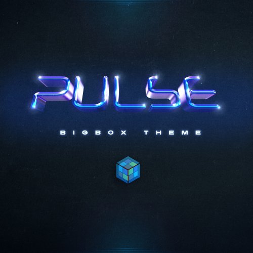
Love the name Pulse! That's so good! A cool sounding word and it fits the glowing line. The positioning of the title and details looks a lot better there. I have to agree with you about the circles. The blue is honestly nice but a bit too popping. Maybe the other icons should be grey also. It seems a little funny to have only one thing pop with that blue(other than the glow itself). Glad you like the icons! This is simply my favorite theme. I may be a little biased because I helped a little, but still. Love it! One tiny thing I just thought of, I like how you have the lines for the selected logo at the bottom in that image . Are those two lines darker than the rest of the lines? It's just is a little hard to see those. I think the lines work well there. Maybe make them a bit more visible.
-
Nice! I do enjoy those circles. The blue is not bad really! I like how it's tied to the same color as the glow. The completed, favorite, broken look nice. For some reason, I drew some new icons for you to look at. I tried to simplify the trophy a bit and also rethink the broken icon. Your current icons are literally, perfectly fine though. The only one I had qualms about was the broken icon. It's a bit unclear to me. I don't have your blue so you'd have to recolor them. I just made them black. I included a vector pdf if you want to change it. Theres 5 icons 2 possible for broken and completed and the same heart favorite. You won't hurt my feelings if you don't want to use them. I did them on a whim. No big. I still think the info could go up a touch closer to the title. Also should the title and all its info be centered in the upper section? Not sure. The theme's great! I'm nitpicking here. I also included a new coloring for 2 logos Neo Geo AES and NEC Supergrafx. Both were pretty off and now are more vivid and much closer to the original imo. Icons + Couple of Logos.zip
-
Man! That looks great! Amazing job! I think the rating under the box works well but what if you replaced the stars with the circles from your previous theme. I thought those circles looked clean. I imagine it as the same light grey used elsewhere. If you think the stars work better than I still think it should be the light grey. The only other thing is, I think the info below the title should be a tiny bit closer to the game title. I can't wait to use this theme. Excellent stuff!
-
What about this? It's not perfect, but I may have a couple of good thoughts within this screenshot. So, I'm not a big fan of having the various pieces of information being spread out so much in the example you showed. The layout that I'm suggesting has info more grouped together. All icons are in the top right. There may be a better solution for where the icons should go. I put the platform name above and centered. To me that makes perfect sense. I realize you had the video/screenshot centered in the left half. I imagined it being right aligned to the center. That may not be possible. If not it's good the way it was too. I think the year and genre belong with the title since its the most important information to me. I think the line on the left of the title looks good and helps it to feel less like its floating in the middle of nowhere. I should have centered the dev/title/year/genre vertically (I did this in a hurry lol). I don't mind the one grey gradient across the entire screen like you have it but I still think that it ads depth for the top and bottom to feel separate. I kept the gradient like you had it but I added a drop shadow under the glow line. It's not exactly a perfect solution but it does give it some depth. These are just some rough thoughts, see what you think.
-
Altered the colors on several logos here. I looked at multiple references images and tried to do an average shade based on what I was commonly seeing. I don't know how I had the 32x and Super Acan logo so dark and didn't notice lol. The PC Engine was orange because I used a photo that was at an angle so the logo had more of a orange tint. I don't know why I didn't see that one earlier. From all the photos I've seen, it's a true red with like, one drop of pink. The SNES logo is nearly the brightest RGB red. Super Acan is brighter and more saturated. The 32X is brighter and the 90s style Sega logo is a bit more bright as well. I sent a genesis logo with this brighter Sega logo too(It only effected one version). I also am sending a new NES logo only because the previous registration mark was misshapen somehow and I added a version with white fill if you want that instead. Also the red is now the more vivid Nintendo Switch red. It's a minor difference. The TG16/CD logos I think are much closer too. I'm looking hard at the colors as I'm doing my final organizations to the logos. I may find a couple more at some point but nothing super obvious has hit me yet other than what you mentioned. new colored logos.7z
-
Interesting about the snes logo. I see what you're saying. I'll give you a brighter one with those others I'm altering colors on. I might include the darker one in my full set later as an alternate. I'm going to have to agree with kidsholin here. I do kinda like the great/black better. I did like the color on the glow line with the greyscale. The purple is good too though! I just prefer the previous color scheme a bit more. Maybe there can be both? While the name may change from bare bones, the minimalistic approach is what drew me to this theme. That's still in the themes DNA. If it's called Midnight it could definitely be purple but greys and blacks would work just as well.
-
I will have to go through those and see if I can't get a better color for them. If you see any others please let me know. The only one out of what you mentioned that I will defend is the super Nintendo logo. I'm pretty positive that one actually is right. That is actually an official vector from Nintendo. https://www.nintendo.com/super-nes-classic/ . Although there's a chance that the new logo is darker than the original logo used in the 90s. Anyways, if you don't mind, I'll send you those ones updated sometime soon. Thanks for the logo feedback!
-
Hey thanks. No problem, you can use whatever logos you like! That being said, I want to fix/improve the ones you think are not the right colors. I have done a lot of research on the logos and I see a lot of inconsistent colors and faded images with weird lighting, so it's hard for me to tell what the real colors are. One of the ones I know that's a bit dark is the turbo grafx/cd logos. The only reason those ones are so dark is because on the official TG16 mini website, the logos are those exact colors I swear. I've already thought those ones need a lighter version. The main thing that I know is improved on my logos is the actual logo shapes themselves. The colors though...are not always so perfect. I would really appreciate your feedback on which ones seem off in color! You don't have to know the exact color, just give me a list of which ones you think are too dark. I want them to be as accurate as possible. You can still use whatever logos you like obviously. I've been wanting to ask, are you sold on the name Bare Bones? This is such a cool theme. I feel like the name almost undersells it! If you love the name, that's totally cool. I've just thought about some alternate names. What about something like: "Midnight", "Glow Line", "Essential" (because its only the essentials) or even "Essence". I don't know, I'm not really good with names myself but maybe there's a cooler sounding name you haven't thought of. See what you can do with the animation. The subtle bounce is 100% not necessary but it's a neat option. I'm sure you'll come up with something very clean. Thanks for your hard work! Also, thank you for humoring me with all the advice I've given you on this theme. You definitely didn't need me! You have great ideas! ? Again, if you could, please send me a list of logos that need a color adjust. I trust your opinion! EDIT: I made a new MAME Logo that's a bit cleaner. It's the exact same logo but there's several small alignment fixes from the original logo. You don't have to use it but I thought I'd send it to you now that I made it. It was a last minute addition. New MAME logo.7z