
Dan Patrick
-
Posts
175 -
Joined
-
Last visited
-
Days Won
8
Content Type
Profiles
Forums
Articles
Downloads
Gallery
Blogs
Everything posted by Dan Patrick
-

ABeezy's Nintendo Game Boy Color Carts
Dan Patrick commented on ABeezy13's file in Nintendo Game Boy Color
.thumb.png.02858da8c30e15bb1915017070587795.png) Appreciate your work! Looks amazing
Appreciate your work! Looks amazing -
 I'll add that to my upcoming update. That wouldn't be too hard to add and I already had thought about making that version but didn't. The reason I didn't make it so far is that to my knowledge that style of Atari 7800 logo was never officially used. But I like that they'd all match so I want to add that.
 -
Thank you for this extensive feedback. I will update the recommended packs to include the missing ones that I've forgotten to include. Thanks for catching that! Several of the ones you list have no version in any set as I didn't draw them. I'm planning on an update at some point to add a few.
- 87 comments
-
- 1
-

-
- platform clear logo
- platform logo
- (and 6 more)
-
I made a Reddit post about this post . I commented on some stuff already. Thought I'd just link it here. https://www.reddit.com/r/emulation/comments/tjki3p/i_redrew_every_consoles_logo_for_emulation/
- 87 comments
-
- 2
-
-

-
- platform clear logo
- platform logo
- (and 6 more)
-
No problem at all! I know I named the Mega CD and Sega MegaDrive Sega CD and Sega Genesis respectively because I believe thats how Launchbox wants it. Maybe I'm wrong and need to rename them to their "real" names. But yeah check again I believe they're there under those names.
-
Thank you! Thanks for your respectful attitude. I'd like to see the list but no promises. If there's a lot then please highlight the couple that seem like the biggest omissions to you.
-
Thanks a lot for your kind words. You may have found a legitimate flaw it seems. I did indeed draw those. What set did you download?
-
I was looking into this. I think its legally questionable to do so not to mention many of those say that the file can't be updated. It's not worth getting in trouble for lol. looking into archive.org as another place to house them. We'll see
-
I love all the feedback people! Thanks so much. You've made it feel more worth it already!
- 87 comments
-
- 2
-
-

-
- platform clear logo
- platform logo
- (and 6 more)
-
Version 2.1.0
20,912 downloads
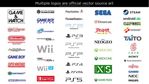
This is a giant collection of platform logos drawn digitally by hand. This took well over 500 hours of work over 15 months. While console logos exist all over the internet, this collection aims to bring them to a higher level of polish and accuracy. The default logos in BigBox will now come from this set. It was extremely tedious to ensure a very high level of accuracy across thousands of files. So Many Versions! Each included platform has multiple logo variants. Basically, many consoles had different logos for different regions and time periods. There are also smaller variations such as with or without a trademark (tm). There are black and white versions for each of these. With all of these it can add up to over 50 small variations for one platform! This would be impossible to navigate so I’ve split them up into smaller categories. For each format (Normal, Large and SVG) there are Light and Dark folders. For either of those there are: “Color”, “Black & White” and “Just White” (or Just Black respectively). If you wanted to use a minimalistic dark theme, you could use the “Just White” versions for a contemporary look. If you wanted logos for a standard dark theme then you could use “Light - Color”. Official Versions Included Besides the many hand drawn logos, I’ve also curated multiple logos that are the OFFICIAL renderings. Meaning, vector art ripped from official sources such as websites and pdf manuals. Finding official source art in the wild is pretty uncommon and required many hours of digging. Most of the source art was not in color so most of these colors are still generated by me. Some of the platforms with official logos include: Sadly, some of these wasted a lot of my time because I drew them and later found the official versions. The Drawing Process: My process for drawing a logo required many steps. I first did research on each logo. Then I would dig deep for the best references I could find. One rule I had was to never trust any image. I would compare multiple sources and make sure the source I chose was not fan made or some modern re-release that changed the logo. If a better source was found that showed differences from what I drew I would redraw it again (it sucked). I redrew the NEO GEO logo about 5 times before I was finally happy with it. Generally, source art would include box art images, adverts, brochures, and manual scans. Archive.org and Manualslib.com were a huge help for a lot of these scans. I would then use the pen tool in Adobe Illustrator and go to town! Sometimes if my source was really amazing, I could finish the whole logo in an hour and a half or so. Other times it would take much, much longer. Getting the correct color was always challenging and required intelligent guesswork. For example, with the classic Konami logo, I brought in 20 images. Gathered the color from all of those and found the average color for the red and orange. Then I’d tweak it slightly more, usually to improve saturation. When it came to fonts, I would always search for it but rarely found exact matches. If the font was found I’d obviously use it, but If not I’d have to hand draw it. However, a couple of the smaller taglines/subtitles do use a very close match. Hand drawing those fonts would do more harm than good. While drawing a logo I took great care to make things as visually pleasing as possible. Every little section of each letter of each logo was considered. Curves were carefully made to be smooth with as few anchor points as possible. Letters align with each other and angled letters all share the same angle. Hand drawing fonts is very tricky. Many logos were substantially harder than I’d anticipated. The Sega Saturn US logo for instance, drove me insane. It took over 40 hours to draw (not to mention wasted time from failed attempts months earlier). I used Adobe Illustrator to mimic every highlight, tiny color shift, shading and glow. When I was working on this logo, I’d come home from my graphic design day job and then spend 4 hours on it, which would only finish part of one letter. As I worked, I’d have a couple copies of the logo in the same file and a couple times it bottomed out 32GB of ram! Unique Versions This collection brings a few unique logos to the table. I’m just going to list a few. I created multiple new arcade and pinball logos, although previous arcade logos are here too. I highly polished the Daphne logo as it needed some love. I drew a detailed version of the TeknoParrot logo which seems to be uncommon in high resolution. I also created Sega system 16 and 32 arcade logos based on the exact font used in the Sega 32X and Sega CD (Copperplate Gothic Std 31AB stretched horizontally to 130%). The Capcom logos have stylized alternate versions based on a gradated version Capcom rarely uses. There are several other unique logos I could list here. White Outline - Default Versions Since these logos are replacing the default logos in BigBox, Faeran smartly requested that I create versions with white outlines around the outside. That way logos could be seen against any background color. I only made the outline versions for the options I gave to Faeran. I don’t plan on making outline versions for the rest of the variations. That said, the versions I did make are included here. The outline versions don’t look quite as nice in my opinion but they serve a very functional and important purpose. Solid black logos for some systems, like the PSP, would not be visible in certain themes without a white outline. However, theme creators or those wanting to add logos to a single theme, I would still recommend the non-outline versions for the cleanest look. Conclusion I included every platform and version that I wanted to. There are some more obscure ones I could draw but I didn’t see the need to seeing as how I've created 22,000 files as is. If I knew how much work this was going to take, I would've never gotten myself into this (lol). I hope that you guys get a lot of enjoyment out of these. I’m glad I made them and it feels really good to finally be able to upload them. I made these originally for LaunchBox but they can be used elsewhere. I will always appreciate credit if you use them. Needless to say, I don’t own the rights to the logos and these are NEVER to be sold in any way. Thanks Special thanks to Juketstu and Faeran for their valuable feedback. Also, huge thanks again to Faeran and the LaunchBox team for using these as the new defaults for BigBox! If you like what you see here, please also check out my LaunchBox / BigBox logo collection & Pineapple Graphics' Photoreal Controller Vectors:- 87 comments
- 33 reviews
-
- 165
-
-
-
-

-
- platform clear logo
- platform logo
- (and 6 more)
-
v2 Platform Logos Professionally Redrawn + Official Versions, New BigBox Defaults View File This is a giant collection of platform logos drawn digitally by hand. This took well over 500 hours of work over 15 months. While console logos exist all over the internet, this collection aims to bring them to a higher level of polish and accuracy. The default logos in BigBox will now come from this set. It was extremely tedious to ensure a very high level of accuracy across thousands of files. So Many Versions! Each included platform has multiple logo variants. Basically, many consoles had different logos for different regions and time periods. There are also smaller variations such as with or without a trademark (tm). There are black and white versions for each of these. With all of these it can add up to over 50 small variations for one platform! This would be impossible to navigate so I’ve split them up into smaller categories. For each format (Normal, Large and SVG) there are Light and Dark folders. For either of those there are: “Color”, “Black & White” and “Just White” (or Just Black respectively). If you wanted to use a minimalistic dark theme, you could use the “Just White” versions for a contemporary look. If you wanted logos for a standard dark theme then you could use “Light - Color”. Official Versions Included Besides the many hand drawn logos, I’ve also curated multiple logos that are the OFFICIAL renderings. Meaning, vector art ripped from official sources such as websites and pdf manuals. Finding official source art in the wild is pretty uncommon and required many hours of digging. Most of the source art was not in color so most of these colors are still generated by me. Some of the platforms with official logos include: Sadly, some of these wasted a lot of my time because I drew them and later found the official versions. The Drawing Process: My process for drawing a logo required many steps. I first did research on each logo. Then I would dig deep for the best references I could find. One rule I had was to never trust any image. I would compare multiple sources and make sure the source I chose was not fan made or some modern re-release that changed the logo. If a better source was found that showed differences from what I drew I would redraw it again (it sucked). I redrew the NEO GEO logo about 5 times before I was finally happy with it. Generally, source art would include box art images, adverts, brochures, and manual scans. Archive.org and Manualslib.com were a huge help for a lot of these scans. I would then use the pen tool in Adobe Illustrator and go to town! Sometimes if my source was really amazing, I could finish the whole logo in an hour and a half or so. Other times it would take much, much longer. Getting the correct color was always challenging and required intelligent guesswork. For example, with the classic Konami logo, I brought in 20 images. Gathered the color from all of those and found the average color for the red and orange. Then I’d tweak it slightly more, usually to improve saturation. When it came to fonts, I would always search for it but rarely found exact matches. If the font was found I’d obviously use it, but If not I’d have to hand draw it. However, a couple of the smaller taglines/subtitles do use a very close match. Hand drawing those fonts would do more harm than good. While drawing a logo I took great care to make things as visually pleasing as possible. Every little section of each letter of each logo was considered. Curves were carefully made to be smooth with as few anchor points as possible. Letters align with each other and angled letters all share the same angle. Hand drawing fonts is very tricky. Many logos were substantially harder than I’d anticipated. The Sega Saturn US logo for instance, drove me insane. It took over 40 hours to draw (not to mention wasted time from failed attempts months earlier). I used Adobe Illustrator to mimic every highlight, tiny color shift, shading and glow. When I was working on this logo, I’d come home from my graphic design day job and then spend 4 hours on it, which would only finish part of one letter. As I worked, I’d have a couple copies of the logo in the same file and a couple times it bottomed out 32GB of ram! Unique Versions This collection brings a few unique logos to the table. I’m just going to list a few. I created multiple new arcade and pinball logos, although previous arcade logos are here too. I highly polished the Daphne logo as it needed some love. I drew a detailed version of the TeknoParrot logo which seems to be uncommon in high resolution. I also created Sega system 16 and 32 arcade logos based on the exact font used in the Sega 32X and Sega CD (Copperplate Gothic Std 31AB stretched horizontally to 130%). The Capcom logos have stylized alternate versions based on a gradated version Capcom rarely uses. There are several other unique logos I could list here. White Outline - Default Versions Since these logos are replacing the default logos in BigBox, Faeran smartly requested that I create versions with white outlines around the outside. That way logos could be seen against any background color. I only made the outline versions for the options I gave to Faeran. I don’t plan on making outline versions for the rest of the variations. That said, the versions I did make are included here. The outline versions don’t look quite as nice in my opinion but they serve a very functional and important purpose. Solid black logos for some systems, like the PSP, would not be visible in certain themes without a white outline. However, theme creators or those wanting to add logos to a single theme, I would still recommend the non-outline versions for the cleanest look. Conclusion I included every platform and version that I wanted to. There are some more obscure ones I could draw but I didn’t see the need to seeing as how I've created 22,000 files as is. If I knew how much work this was going to take I would've never gotten myself into this (lol). I hope that you guys get a lot of enjoyment out of these. I’m glad I made them and it feels really good to finally be able to upload them. I made these originally for LaunchBox but they can be used elsewhere. I will always appreciate credit if you use them. Needless to say, I don’t own the rights to the logos and these are NEVER to be sold in any way. Thanks Special thanks to Juketstu and Faeran for their valuable feedback. Also, huge thanks again to Faeran and the LaunchBox team for using these as the new defaults for BigBox! If you like what you see here, please also check out my LaunchBox / BigBox logo collection & Pineapple Graphics' Photoreal Controller Vectors: Submitter Dan Patrick Submitted 03/20/2022 Category Platform Clear Logos
- 3 replies
-
- 1
-
-
- platform clear logo
- platform logo
- (and 6 more)
-
Version 1.0.0
1,978 downloads
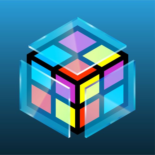
While I am not the original creator of the LaunchBox / BigBox logos, I have the best versions available in this collection. After roughly 30 hours, I have redrawn and perfected the recognizable cube shape and have multiple variants for multiple use cases. All previously used versions are available here, as well as new versions that are slightly different. All my drawings use perspective correct line work making these the best versions of these logos. They come in three sizes Small (1920x1080 max), Large (3840x2160 max) and SVG which is a vector file type. A lot of the BigBox logos can’t be properly saved in SVG format so I included vector PDFs for all logos as well. The LaunchBox logo had some uneven shapes which I corrected. In addition, I noticed the entire LaunchBox logo is not a perfect cube. Its sides are actually rectangles. I never noticed this until now. Once I saw it, I created a separate perspective correct version. I created a further revised version as well, with thicker lines, consistent line widths and punchier colors. The same standard goes for the BigBox logos. The thicker LB logo also has a glass BigBox variant which took a solid amount of work to get right. I really tried to make the glass thick enough to not be too busy and easily visible large or small. I went back and forth on every shade of every gradient until I felt it looked pretty good against dark and light backgrounds. The only versions that are official are the original taller designs. I wanted to improve them as much as I could while still keeping all of the artist’s intent. Feel free to use these how you’d like. I’ll always appreciate credit. If you like what you see here, please also check out my extensive platform logo collection:- 7 comments
- 1 review
-
- 30
-
-
-
-
-
- launchbox logo
- bigbox logo
- (and 9 more)
-
 Uniform grid baby! So awesome faeran. Thanks for the hard work on this!
 -
 Ooh looks great. Excited to try this one! Thanks
 -
 Glad to see this one recreated! Thanks faeran
 -
Yes! this would actually be used by me
-
Good stuff! I'm following you and just got notified of this. Nice!
-
Upcoming Professional Clear Logo Collection. Vector redraws etc.
Dan Patrick replied to Dan Patrick's topic in Platform Media
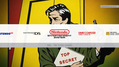
Yup! I have done substantially more work on this than anticipated and have added many more platforms than originally planned. I have now spent hundreds of hours on this and it will very shortly be uploaded. Sorry to the small handful who have been waiting. The quality of the whole collection is on another level. One of the biggest boosts to the collection is that now many of the logos included will be official source vector art scraped from dozens of websites and vector pdfs. Also, as a fun surprise, I can confirm these will be the new default logos included in BigBox. Every platform includes multiple versions but the most sensible version will be used as the default and will have a white outline to be most visible in every theme. You will see the proof of these words very soon. Here's one example...
- 10 replies
-
- 6
-
-
-
-
-
- 4k
- platform clear logo
- (and 3 more)
-
 Definitely unique! I don't know how you're doing that but keep it up. This is interesting.
 -
 New updates look awesome! Thanks Juketsu for your many hours on this!
 -
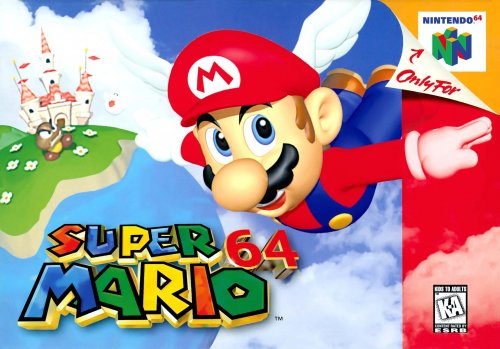
Official N64 Box Art By Nintendo For N64 Online App1.0.0 View File This is a collection of 13 N64 box arts released by Nintendo themselves. These are the highest quality these boxes have ever been. These were released in lieu of the N64 online app for the Switch. Source: https://twitter.com/AndreSegers/status/1441266976966397952 Also, there's never been an official western box for Sin & Punishment until this. Thanks Nintendo! Included are the original JFIF files and the ones I converted to JPG format. Submitter Dan Patrick Submitted 09/25/2021 Category Game Box Art
-
Version 1.0.0
325 downloads
This is a collection of 13 N64 box arts released by Nintendo themselves. These are the highest quality these boxes have ever been. These were released in lieu of the N64 online app for the Switch. Source: https://twitter.com/AndreSegers/status/1441266976966397952 Also, there's never been an official western box for Sin & Punishment until this. Thanks Nintendo! Included are the original JFIF files and the ones I converted to JPG format. -
N64 Online App Official Box Art, Retouched By Nintendo View File This is a collection of 13 N64 box arts released by Nintendo themselves. These are the highest quality these boxes have ever been. These were released in lieu of the N64 online app for the Switch. Source: https://twitter.com/AndreSegers/status/1441266976966397952 Also, there's never been an official western box for Sin & Punishment until this. Thanks Nintendo! Included are the original JFIF files and the ones I converted to JPG format. Submitter Dan Patrick Submitted 09/25/2021 Category Game Box Art
-
Dang dude! This looks sick. I like everything I'm seeing here! Excellent. One tiny suggestion would be for the 3 icons on the top right. Maybe they should only light up blue to match the theme. Also I don't love the little gradient that they have. Maybe that should change. Overall this looks awesome! That wall view looks amazing!
-
 This looks really nice! Thanks faeran! I love seeing the wall view experimentation

.thumb.png.02858da8c30e15bb1915017070587795.png)


