
Dan Patrick
-
Posts
175 -
Joined
-
Last visited
-
Days Won
8
Content Type
Profiles
Forums
Articles
Downloads
Gallery
Blogs
Everything posted by Dan Patrick
-
Thanks! I didn't even think about the platform view top section to be connected like that. That's such a good, simple solution for that. I literally love that! Happy to see the "available games" part figured out too! That looks great! Dude, this theme is dope! I made a very rough and quick video showcasing an animation technique I think you could try. The 4k/hd version of the video is still processing. It's a subtle bounce that has to be created manually with 2 different animations. I couldn't explain it without a little video. Anyway, I was thinking that bounce effect would look great for the platform images as they come in.
-
Thimolor this theme continues to impress! It's awesome! I'm all for the simpler logo idea. Having two images of the console was a little redundant anyway. I have alternate colors and versions for all of the logos I gave you. If you want a different version of one just ask and I can get it to you asap! I see that the amount of glow you have varies per view. I personally think a couple of the views could have the glow paired back just a touch. I love the amount of glow you show in your text games view. That's the perfect amount to me personally. I think it does make sense to allow for a little more glow on that vertical wheel you show in your last screen shot but imo still toned back just a hair. On the platform images views...I got a screenshot edit I quickly worked up. It's all the same except a couple ideas I had. I altered the glow (insert your colors because I don't know the exact blue you use). I'm not a huge fan of the bobbing up and down of the platform image. Instead , I’d recommend just a fade in and slide upwards about 15 pixels or so that would happen in maybe half a second then it stops smoothly. That's just me. Overall I love that view though! Also I've been meaning to tell you about a trick to get the "336 Available Games" thing to work. I have done this myself and I know it works. I got the tip from Retro Faeran. It's on this video at exactly 2:51:46 https://www.youtube.com/watch?v=Wv5d1e8KOIc&t=10306s User Source.7z

-
Sorry for this minor update. I wanted to update 2 of the logos. This is the last update lol. The Amiga logo I added a little shadow(very minor I know) and the Triforce logo is totally new. I will be releasing all of these officially soon.
-
Do whatever you want with these logos. Let me know if one seems off. Also sorry they are unorganized at the moment but the logos are good to go. Arcade + Console Logos.7z
-
You've already made great progress. Don't overwork yourself. There's no rush!
-
Nice! The line looks good like that I think. I have been working on solutions for the best platform images myself. The set of platform images you have for that larger Sega Genesis image I'm not the biggest fan of because while some of them are great, some others in that set are weird (look at the game boy advance one for instance). The best platform image photograph images are (as you know) the ones from Evan Amos. He has made some cut out versions of a lot of the platforms. I had downloaded the cut out versions from https://commons.wikimedia.org/wiki/User:Evan-Amos because I was going to use them for my theme (I put it on hold because I was making the logos). Anyway, I went ahead and uploaded the cut out versions Evan Amos made here. Maybe you could just add the image on your grey gradient? Not sure. You might check them all because a couple images have white specks showing(look at the Odyssey 2) so a couple might need to be touched up a bit. I am including my handheld logos because I already had completely finished those. I made multiple versions of each logo but only sent the recommended ones for your theme. I'll send you the rest of them later today or tomorrow after I get off work. I sent these all as high res PNG's but if you want vector files of the logos I have those too. What about this look from your Dirty Old theme? It's simple but it works well. What if you just added the colored gradient line where the green line is and added the thin grey line, platform name, year etc on top matching the style used elsewhere in the bare bones theme? ---Edit--- Got the computer logos here as well. I will get the rest to you tomorrow I think. Don't feel like you need a banner for all of these logos. Whatever ones you feel like. Some of these are pretty obscure. System Images.7z Handheld Logos.7z Computer Logos.7z
-
Hey thimolor, I have new accurate logos that I'm still organizing. Let me send you a special pack just for your theme. I swear these logos that I've made are the best ones out there. I have spent an extreme amount of time redrawing logos from really accurate sources. It seems that you already made banners so perhaps I'm already too late. If I could get it to you today could you use them? You 100% don't have to but it's a thought. Besides that...I have a couple tiny adjustment suggestions: On your banner and box art view, to me the year and rating seems too disconnected on the right. Although I definitely see what you're doing. How about this: for the box art view maybe have the rating below the console name again and the year below the game title. Maybe you could even leave it as it is but make the year and genre on the left and rating and times played on the right. My thought there is that year and genre are the most important of those 4 things so having it closer in eyes view makes sense to me. On the platform view: for the video...maybe this could shrink just a hair to align it with your top and bottom lines. I think the year should be above "number of games" above the lower line. The number of games icon is cool. To me it's not quite clear enough as to what it is on its own. Maybe if it said "306 games" it would be clearer. On all your views...to me the colored line needs to still be a hair thicker. I'm not sure. It either needs to be the same width as other lines or noticeably thicker. Right now to me its only a tiny bit thicker. It's your call on that. The glow effect is a good idea! Great job!
-
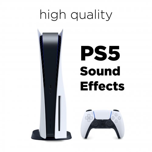
PS5 UI Sounds (High Quality) View File This is a sound effects pack from the Playstation 5's menu. These are really nice, high quality sounds and they were recorded with background music off. I ripped them from this source: "https://www.youtube.com/watch?v=Mdh1G7TQhVM&t=0s". I made sure there was zero popping in the audio. There's two sets here with the startup sound too. It's good to go! Enjoy! To use these, simply download and unzip the file. Place the folder into your "LaunchBox/Sounds" folder. Then launch BigBox and go into the "Options" select "Sound" and change the "Sound Pack" to "PS5". Submitter Dan Patrick Submitted 02/20/2021 Category Big Box Sound Packs
- 1 reply
-
- 2
-

-

-
- ps5
- sound pack
- (and 5 more)
-
Version 1.0.0
3,022 downloads
This is a sound effects pack from the Playstation 5's menu. These are really nice, high quality sounds and they were recorded with background music off. I ripped them from this source: "https://www.youtube.com/watch?v=Mdh1G7TQhVM&t=0s". I made sure there was zero popping in the audio. There's two sets here with the startup sound too. It's good to go! Enjoy! To use these, simply download and unzip the file. Place the folder into your "LaunchBox/Sounds" folder. Then launch BigBox and go into the "Options" select "Sound" and change the "Sound Pack" to "PS5".- 4 comments
- 2 reviews
-
- 7
-
-
-

-
- playstation 5
- sounds
- (and 5 more)
-
The greys you're using look really good. Especially on the details view. The right side of the box art views is the only part to me that is a little low in contrast. Maybe use the brighter grey gradient used in the details page. I actually like that you removed the three icons that were at the top right too. This is incredible! Yeah dude, I've got nothing else to say! I see you took several thoughts I had and the adjustments you made to the layout look super great! I'm hyped to use this! Thanks thimolor!
-
Cool stuff thimolor! I'm going to give a couple more thoughts here if that's alright with you... 1) You showed that game details view. You nailed it there! The first image of the two gets my vote because I love how the box aligns with the right details. I also enjoy the little gap in the vertical line. Keep that! I studied that page and really tried to be critical (sorry lol). I edited the screen shot and wrote some stuff on it. I was being really really nitpicky so obviously just ignore whatever you don't like out of that. 2) The text views you just showed are (to me personally) a step in the wrong direction. That's a little too bare bones imo. I'm mainly talking about color (the layout seems fine). From previous versions I liked the very subtle gradients and the left section being noticeably darker. I liked how you initially had the gradient line about twice as thick as your other grey lines. I personally like that (only for that one line). That to me gives it some extra oomph and if its thinner like the other lines it's not quite as strong. Basically the styling I show in these images I included here is how I personally want it to be styled throughout. Basically I think it should be bare but with just enough oomph! Hopefully I haven't come across too negative here. I truly do love the theme! I'm just being really nit-picky. Again, these are just my personal thoughts. This is your theme, do what you want with it. Thanks for allowing me to give my critical eye to this! Keep going man! Appreciate your hard work!
-
Very Cool!! Glad you liked my feedback. Looking good! Couple of tiny things...On the text view: I'd personally align the year/developer/genre part to the top of the game title. I'd also make the rating number grey and not white (totally a preference). The navy selection bar I feel should butt right up against the main right section (in other words, no tiny black gap). On the box art view...That looks super cool! I say have two versions of box art views, One that's the round carousel style you have there, and then a second one that's more "bare bones" that has a flat wheel like you had before but just add a similar glow effect. Obviously the stuff I'm mentioning is just thoughts. You do you!
-
I personally think your icons should all be the grey like how you did number of players and play count. In other words, the star(and text by it) and the favorite and trophy icons should be that same grey. That's just my opinion. I like how the only colored thing besides game media is the line and that navy in the text view. The general lack of color fits the bare bones aesthetic! I love it! On the box art view, it's not clear enough to me what box is selected. Maybe the boxes around it should desaturate slightly or maybe the selected box should get slightly bigger. I'm sure you'll work that out. I know it's a work in progress. On your text view, I agree that the box art would look better if it was larger. How about this...The year, manufacturer and genre go to the right of the game description right aligned with the video, The box art can scale to the full height of the video then. It's a thought! I don't know if I fully like the data on the right side but it's not too bad. The first screenshot shows my alignment suggestions. The background isn't supposed to be all blocky so ignore that part of my example. Your theme is absolutely great looking! It will probably become my instant new favorite. Looks great Thimolor!
-
Oooh this looks promising! Fast classic became dirty old. This is going back to that original minimalistic vision. I like what I'm seeing. I'm all about this simplicity. Just a few views is plenty. Excited to see more of this! Thanks for all your hard work.
-
.thumb.png.f0fec3092b5882e3c7cb67a4e572ce2b.png) Thanks for your work on this !
Thanks for your work on this ! -

Upcoming Professional Clear Logo Collection. Vector redraws etc.
Dan Patrick replied to Dan Patrick's topic in Platform Media
This is almost done now! Hopefully within a week! I keep adding more logos and perfected others as much as I can. I also recently found archive.org has tons of great manual scans so I've been using that for logo references now too.- 10 replies
-
- 4
-
-
-

-
- 4k
- platform clear logo
- (and 3 more)
-
 Great collection! Did you draw any of these yourself or just compiled it all together? Just curious... Thanks for the collection.
 -
big box theme dirtyOld (Theme is no longer available)
Dan Patrick replied to thimolor's topic in Big Box Custom Themes
Truly amazing work! Everybody needs to try this one! -
These banners look great! Nice and simple. I like the images you're using for the hardware there. It's looking really dope!
-
This is looking really great! Love the animations! That really adds a lot of polish to it. I also like the circles for the rating. That muted texture effect for the backgrounds is really well done. I can't wait to try this one! Looks like one of the best themes yet! Thanks for your hard work on this.
-
Upcoming Professional Clear Logo Collection. Vector redraws etc.
Dan Patrick replied to Dan Patrick's topic in Platform Media
Thanks! Still working hard on it. Getting closer to being done! -
I'm currently creating/modifying a full(?) set of platform clear logos. By creating I mean literally DRAWING FROM SCRATCH in Adobe Illustrator in vector! One logo can range from taking one hour and go up to FOUR HOURS to perfect! Of course many of the logos have great versions already available and I won't be drawing those from scratch but simply examining thoroughly and touching up those if necessary. I will release all of these in extreme quality as well as my original vector drawing files. I don't want to take full credit for my upcoming collection because a lot of them will be essentially the same vector svgs used by the emulation station community. I'm combing over all of them though trying to fix flaws and redrawing logos if necessary. All of the ones shown here are either heavily altered or brand new drawings! Thanks to Pit's Arts on the forums for the TeknoParrot PNG that I traced from. I also drew a new arcade classics logo just for fun. The goal of this upcoming platform clear logo collection is to make all of the logos we use for platforms simply more accurate and higher quality. This is not to knock others who have worked hard to create currently used versions in the past but simply to improve upon that hard work further. Hopefully I don't come off as pretentious! I just want to make our platform logos the best they can be! This whole process started because I am also making a theme which needs accurate logos for a collection of hand drawn icons. I was touching up so many logos along the way that I decided to actually focus on just the logos for a while and get them fixed up some. I have spent around 90 hours doing just the logos as of right now! I know that this is not something people care too much about but I hope you can get some enjoyment from my labor of love once I release the full logo set. As a sneak peek of my theme's art, I'm going to show off a couple of my Icon backgrounds here for the first time. The theme will be called "ICONIC". I've been working on it everyday for nearly 3 months . The reason it has taken so long is because I wanted to draw all of these icons very accurately. It will support only about 40 to 50 platforms because It's just not reasonable to do more than that for me. The backgrounds scroll and loop continually through the magic of the theme creators animations. Currently it has a Nintendo style look with greys, reds and white. I know it looks really red but In the theme it's not too overpowering the way I'm using it. I plan to make a more neutral version as well. You'll see more of the ICONIC theme later. I have made a few long Youtube videos that show my tedious logo creation process in action! Feel free to skip around them because they aren't the most exciting videos in the world. If you take a peek at the (rough/unedited) recordings you can feel the vibes I'm putting into these logos. The logo collection will release very soon. The ICONIC theme will release....not as soon but still soon.
- 10 replies
-
- 15
-
-
-

-
-
-
- 4k
- platform clear logo
- (and 3 more)
-
.thumb.png.aa6d291224f4e6ff7f7f256a777c6001.png) Thanks for your work on this man!
Thanks for your work on this man! -
 I thought this was a strange idea for a theme until I saw that sweet cabinet! Pretty unique!
 -
That sounds cool! Thanks.


.thumb.png.f0fec3092b5882e3c7cb67a4e572ce2b.png)


.thumb.png.aa6d291224f4e6ff7f7f256a777c6001.png)
