Jump to content
LaunchBox Community Forums

VisioN 1.1

   (7 reviews)

6 Screenshots

About This File

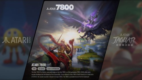
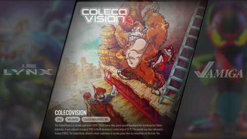
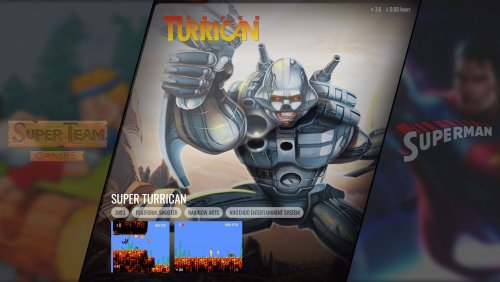
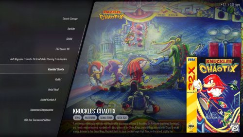
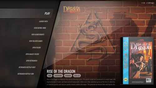
A stylish, background heavy focused theme with inspiration from the unreleased Aura 4k theme by iGarikoitz. The theme itself uses your clear logo images, fanart - background images, screenshot images, and game video snaps to create this completed theme. There is a number of white platform clear logos made by Dan Patrick and 100+ platform/playlist/category backgrounds are included that I have curated with the ability to add your own. This theme will gracefully fall back to different images to make sure something is always displayed.

Requirements

  • LaunchBox must be on version 13.1 or higher (or you'll get errors)
  • Theme is made for a 16:9 aspect ratio

Views

  • Platform Wheel 1 - The main platform wheel for this theme
  • Text Filters View - Used primarily when viewing other filter sections
  • Horizontal Wheel 1 - The main game view for this theme
  • Horizontal Wheel 2 - An alternate game view that uses your screenshots and video snaps
  • Text Games View - Mostly used for the Game Details Menu view, but could be used as a game view


Things to Note

  • 100+ Platform Backgrounds have been included in this theme. You can include your own by placing them in the following folders (The file name needs to match the name of your platform, category, or playlist):
    • Platform Images: LAUNCHBOX\Themes\VisioN\Images\Platforms\Fanart
    • Category Images: LAUNCHBOX\Themes\VisioN\Images\Platform Categories\Fanart
    • Playlist Images: LAUNCHBOX\Themes\VisioN\Images\Playlists\Fanart
  • White Platform Clear Logos have been included by Dan Patrick. You can add your own by placing them into the following folders (The file name needs to match the name of your platform, category, or playlist):
    • Platform Images: LAUNCHBOX\Themes\VisioN\Images\Platforms\Clear Logo
    • Category Images: LAUNCHBOX\Themes\VisioN\Images\Platform Categories\Clear Logo
    • Playlist Images: LAUNCHBOX\Themes\VisioN\Images\Playlists\Clear Logo
  • You can add your own Game Backgrounds that are specific to this theme. You can place them into the following folder (file name must either be based on the game's title, replacing special characters, or named after the LaunchBox Game ID. Check folder for some examples.)
    • LAUNCHBOX\Themes\VisioN\Images\Games\Game Background\[platform name]


For Theme Developers
There are a number of features in this theme that have never been done before. You can examine the code to learn the following:

  • Use of a progress bar with the game count bindings that provides dynamic visual feedback of where you are in your game list as you are navigating around
  • Use of the Index Visibility binding to provide animation triggers. This allows you to provide smooth animations to any element when opening and closing the alpha-numeric index
  • The use of FlowImage (and its bindings) to provide performant image fallbacks. Using FlowImage over an Image element increases performance by loading images in an off-thread, provides better disposal logic, and doesn't lock the file that is located on the hard drive.
  • The use of an item offset converter, which allows you to display images (or metadata) for games that  are (+ or -) around the game or platform that is selected.


Thanks to
Dan Patrick - for use of his white clear logo pack
iGarikoitz - for the initial concept inspiration for this theme


What's New in Version 1.1   See changelog

Released

  • A video has been added to the text game's view
  • Like 16
  • Thanks 5
  • Game On 2
  • Unusual Gem 11

User Feedback

Recommended Comments


Why oh why is it everytime I think I've finished my cab, something absolutely stunning comes along. This looks amazing...

  • Like 3
  • Haha 2
Link to comment
Share on other sites

1 hour ago, vaderag said:

Why oh why is it everytime I think I've finished my cab, something absolutely stunning comes along. This looks amazing...

Variety is the spice of life. Or so they say... 😉

  • Haha 1
Link to comment
Share on other sites

Awesome theme! Progress bar is a nice addition, and navigating feels soo snappy! One of these themes that makes Bigbox really shine! Thank you!

  • Thanks 1
Link to comment
Share on other sites

On the one hand, I'm in awe of how great this looks. The presentation is *chef's kiss* my aesthetic. On the other hand, I yearn for video snaps to be playing. I'm so used to hearing the gameplay when browsing, I discovered I quite miss it. Regardless, excellent job on this theme.

Link to comment
Share on other sites

11 minutes ago, tycho said:

On the one hand, I'm in awe of how great this looks. The presentation is *chef's kiss* my aesthetic. On the other hand, I yearn for video snaps to be playing. I'm so used to hearing the gameplay when browsing, I discovered I quite miss it. Regardless, excellent job on this theme.

I'm with you on this one, can't live without video snaps.

How about making a view with the videosnaps playing in one of the sides instead of the next-previous item? Or on top of the boxart, seems like there's enough empty space there.

Link to comment
Share on other sites

Truly awesome!
I honestly think this is the best theme i've seen so far: sleek, fast, very pleasing to the eyes, stylish and customizable 
Wish there were files for the CTC (for minor tweaks based on personal preferences), but i guess you did all this just using xml code.

Exceptional work Faeran!

Link to comment
Share on other sites

I also wouldn't mind seeing the CTC files here. Two small tweaks that would improve a bit imo. On the text games view, the fanart background goes away when scrolling through the games list. Since the other info and box art is still there I'd figure the fanart should also stay there. Also, I feel the text needs to start scrolling sooner and scroll faster. 

How are you doing that scroll bar trick on the right of the text list? That is cool. I want to steal that for a theme I'm working on.

Link to comment
Share on other sites

27 minutes ago, Dan Patrick said:

How are you doing that scroll bar trick on the right of the text list? That is cool. I want to steal that for a theme I'm working on

Surprisingly, just a basic progress bar element that's native to WPF. It's used everywhere in LaunchBox.

  • Like 1
Link to comment
Share on other sites

What an incredible theme, I'm absolutely in love with it. I'm curious though, have you considered using videos as backgrounds when viewing the actual game lists at all? I honestly think that'd look rather sick, and it would totally solve the issue of no fanart, which most games suffer with ATM. ^^

Link to comment
Share on other sites

Love this theme, it's stunningly gorgeous.

I have to say I agree with some of the above, would love to see video snaps more prominent.  Would also love to see an UltraWide version.
Any chance of CTC files so we can play with it?

Link to comment
Share on other sites

10 hours ago, KyuTrepe said:

Love this theme, it's stunningly gorgeous.

I have to say I agree with some of the above, would love to see video snaps more prominent.  Would also love to see an UltraWide version.
Any chance of CTC files so we can play with it?

It has already been mentioned this theme was made using standard coding methods and not the CTC. So in order to customize this you would need to dabble in backend coding. 

Link to comment
Share on other sites

As Retro808 mentioned, this theme was not made in the CTC, and there are a number of things in this theme that is not currently possible to do in the CTC. In saying that, anyone is free to modify this theme and create new views for it if they wish.

The initial concept of this theme did not include video snap support, and while I have no plans to create views with video support, I'll leave it open for future iterations if I ever circle back to this one. Anyone is free to do so in the meantime.

  • Like 1
Link to comment
Share on other sites

Great Job, Thanks a lot, is possible to Use Video as Background of bothEmulator than inside Each Roms ? With other Themes I see Videos, but with this not ! thanks!

Link to comment
Share on other sites

I love this theme. 1 problem.. I dont have fanart backgrounds for all my games... would be nice to fall back to say maybe the game screenshots, then banners etc. Great work.

Link to comment
Share on other sites

Just wanted to point out that artwork is completely broken for "Platform Categories" and "Playlists" since latest update (13.6-beta-2).

Link to comment
Share on other sites

This is a really incredible theme.  I love that it does a good job of creating cover snaps even for your non-standard categories which fit the theme.  There's only ONE MAJOR PROBLEM that I have, and it prevents me from using this as my primary theme - I can't find any way to actually play my game videos in the games list view.  Please please please allow the text list view to play the videos that are available for each game in the list you're viewing - it makes a huge difference!  Right now it only shows the cover photo/box art.

If I could just have my videos, this would be my #1 theme - absolutely beautiful.

Link to comment
Share on other sites

On 10/6/2023 at 5:19 PM, duerra said:

This is a really incredible theme.  I love that it does a good job of creating cover snaps even for your non-standard categories which fit the theme.  There's only ONE MAJOR PROBLEM that I have, and it prevents me from using this as my primary theme - I can't find any way to actually play my game videos in the games list view.  Please please please allow the text list view to play the videos that are available for each game in the list you're viewing - it makes a huge difference!  Right now it only shows the cover photo/box art.

If I could just have my videos, this would be my #1 theme - absolutely beautiful.

I do not disagree with this. I should probably make some time to create a view that includes videos. I'll add it to my list to take a look at at some point.

  • Like 1
  • Game On 1
Link to comment
Share on other sites

I love this theme really and i would make this to my main theme ... but no videos :( plz consider to make a view with videos pleeeeaasseee 🥰

  • Like 1
Link to comment
Share on other sites

46 minutes ago, Isoku said:

I love this theme really and i would make this to my main theme ... but no videos :( plz consider to make a view with videos pleeeeaasseee 🥰

Actually, one of the horizontal views does have video support. I'll also be releasing an update with videos on the text games view.

Link to comment
Share on other sites

amazing theme, it's been my main since it came out! I always use text view to keep things snappy but its unfortunate that the backgrounds are fanart since a ton of games don't have any or have horrible ones. I would look into changing the background in the coding but I don't really know what I'm doing ;)

Also can't wait for the mentioned update with videos on the text view. I would definitely use that!

Edited by heetsauce
  • Like 1
Link to comment
Share on other sites

I really love this theme but like some people already commented: the fact that needs fanart as background is not ideal. It would be good to show the default background of the current platform. Plus, I would move the video snap to top center, resize it and make it bigger and have the game metadata/description bigger as well. Just my tips for this already great theme!

Link to comment
Share on other sites

I love this theme, which has become my main theme since it came out.

Many thanks for this incredible work, @faeran!

For those who might be interested, I've just uploaded to the “playlist backgrounds” section a huge number of images I use to customize the theme (250 game collections, some arcade game styles and new illustrations for platforms and platform categories).


Capture d'écran 2024-07-24 182537.jpgCapture d'écran 2024-07-24 182605.jpgCapture d'écran 2024-07-24 182645.jpgCapture d'écran 2024-07-24 182835.jpgCapture d'écran 2024-07-24 182909.jpg


Edited by JaredN
  • Like 1
Link to comment
Share on other sites


Join the conversation

You can post now and register later. If you have an account, sign in now to post with your account.

Guest
Unfortunately, your content contains terms that we do not allow. Please edit your content to remove the highlighted words below.
Add a comment...

×   Pasted as rich text.   Paste as plain text instead

  Only 75 emoji are allowed.

×   Your link has been automatically embedded.   Display as a link instead

×   Your previous content has been restored.   Clear editor

×   You cannot paste images directly. Upload or insert images from URL.

×
×
  • Create New...