
Jason Carr
-
Posts
13,723 -
Joined
-
Last visited
-
Days Won
388
Content Type
Profiles
Forums
Articles
Downloads
Gallery
Blogs
Everything posted by Jason Carr
-
You raise a good point, @portachking. I most often don't even think about video game mistranslations from a racial perspective, but I imagine some people could be offended by it. @DOS76, you're very right, the over-sensitivity is getting ridiculous. That said, I'm not out to offend anyone, and especially not racially. So, sigh, I'll have to take it down.
-
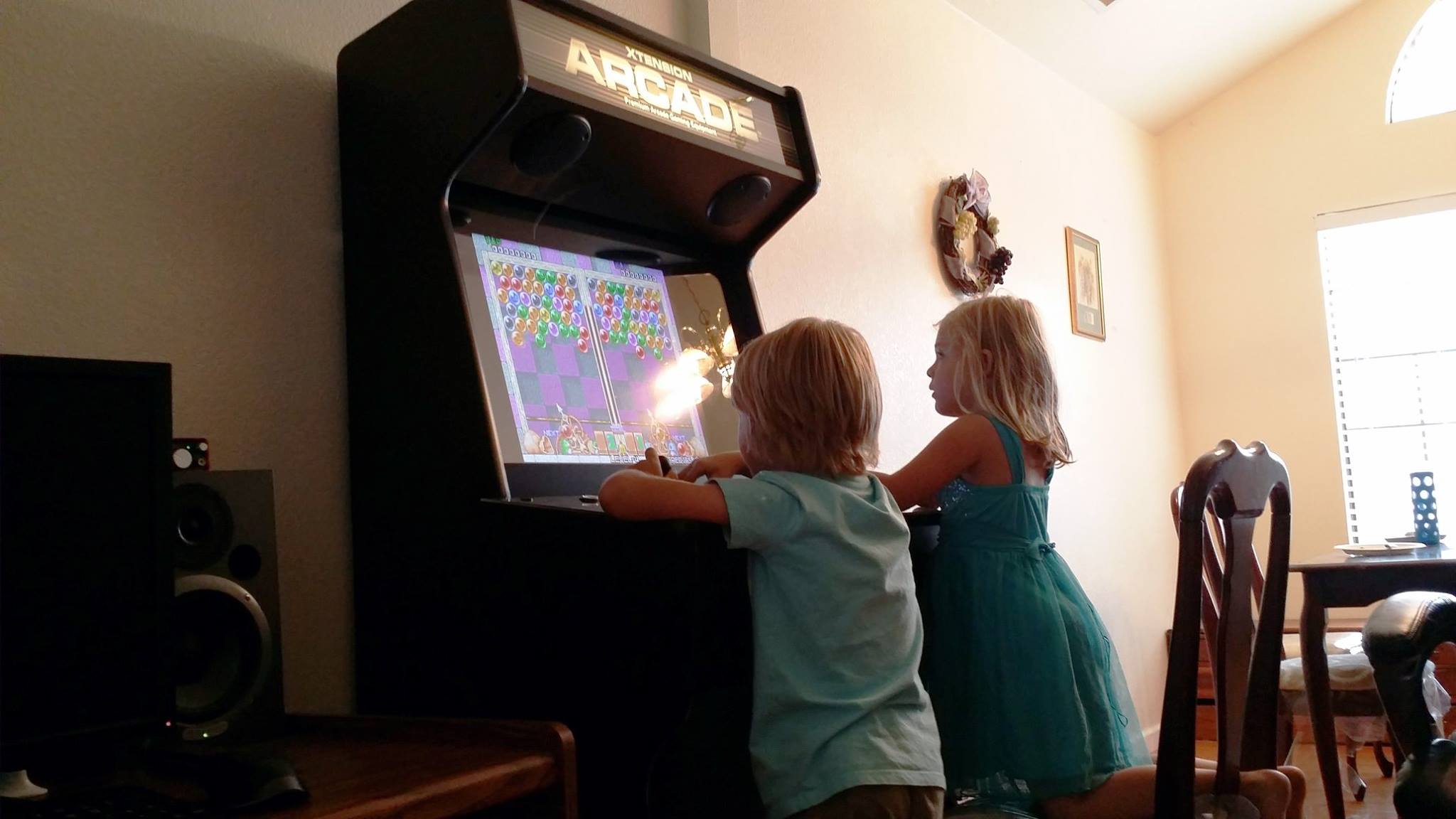
Surprise! New home theater alpha coming out soon...
Jason Carr replied to Jason Carr's topic in Features
Ha, too much boring stuff to do. :P Have to add all the default platform statistics. -
Ha, you're welcome Stimpy. :)
-
My RPG is called Invention Destruction, come play and test it please!
Jason Carr replied to SentaiBrad's topic in Games
I jumped into last night for a bit. Looks really promising, I was impressed. :) -
The Image Thread (Platform Images, Clearlogos, Box Templates and More)
Jason Carr replied to bd00's topic in Contributions
@portachking, no worries, no rush. It'll be a while before the official release. :) @bd00, they all look great. I've tested every single one of them in Big Box and the vast majority of them work really well. These are the problem-child images: Android (not terrible but doesn't stand out very well against brighter images) Atari 7800 (that red blends into the background a bit too much) iOS (the gray is a bit too dark, would probably work well if we just white-washed it) Nintendo Virtual Boy (again with the red blending in) WonderSwan Color (the WonderSwan works fine the but the Color letters blend in) TurboGrafx 16 (looks great but it's too tall to put on top of the games list) Thanks once again, bd. I can jump in and tweak them if needed. :) -
Surprise! New home theater alpha coming out soon...
Jason Carr replied to Jason Carr's topic in Features
@Maddoc1007, I'll keep you in prayer. -
The Image Thread (Platform Images, Clearlogos, Box Templates and More)
Jason Carr replied to bd00's topic in Contributions
Looking good, @bd00. I'll pin this topic. -
Very cool, bd. I'll start testing the images. I'd put up backgrounds to test against, but really it's best to test against multiple images, because every logo is good and bad with different background images. It'd be best to put it in the app using Manage Platforms to get the best idea.
-
Surprise! New home theater alpha coming out soon...
Jason Carr replied to Jason Carr's topic in Features
Alright, beta 5 is out. Still no new features, but the performance should be much, much better. Hit me up with any errors or observations. -
Surprise! New home theater alpha coming out soon...
Jason Carr replied to Jason Carr's topic in Features
Yeah, it'd certainly be easier to put it in LB. That said, there are a lot of options, and probably isn't best to clutter up the desktop Options screen any more than it already is. Not to mention, yeah, as a user I'd prefer if it was in Big Box Mode. So I guess I better bite the bullet and just do it proper. ;) -
:) Yeah, we will be providing some sort of theme options eventually, but honestly I think having a dark background will stick. You're sort of crazy if you want an in-your-face white and bright experience. I don't see the concept of light text on a dark background changing much. As for dimensions, I have been making them as big as I can, basically as big as the original image source allows. This way they can be used as backgrounds too, if desired, eventually. The aspect ratio works better though, of course, when they are wider than they are taller. I should also note that they should all be 24-bit transparent PNG images. Yes, the stroke is because, for example, the red of the SNES logo is too hard to read against the background. This is unfortunately common. Awesome to hear you're hopping on board, @bd00. Thanks a million.
-
BaunchLox the Unfortunate Hippo
-
Thanks guys. Yes, all these features are eventually planned. I do plan on allowing you to customize which images to use where and such. I really like your animated gif idea too, @AFaustini. :)
-
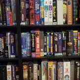
Here are the logos that I've done and included already:
-
@bd00, thanks for all your excellent work. Not to push you, but since @portachking is asking, the next thing that would be nice to have is clear logo images for all the platforms. You can take a look at the ones I've included for GameCube, NES, SNES, MS-DOS, Windows, Atari 2600, etc. They show up on the top of the games list when you load one of those platforms in Big Box Mode. They can be tricky to create, because some platform logos work great as-is, but some need some tweaking. I've found that in a lot of cases using a white Stroke effect in Photoshop really helps. We also want to make sure they're relatively big, 100% clean, and just look good in the app, which is part of the challenge. Any help there would certainly be appreciated. But of course, everyone does better work when they work on what *they* want to work on, so by no means should anyone feel like they need to do just that.
-
Surprise! New home theater alpha coming out soon...
Jason Carr replied to Jason Carr's topic in Features
@bd00 lol, sorry to hear about that. Yes, I will add that as an option soon. I can't decide if I should put the configuration options for Big Box inside of Big Box itself, or if they should go in the desktop mode's Options menu. Any thoughts all? Per that error, ick. That one's gonna be hard to pinpoint; I'll see if I can figure it out. I may have a new version out tonight; I'm hoping so. I've been focusing on performance, so I'm hoping the next version will no longer have any performance issues...should be fully responsive. -
Surprise! New home theater alpha coming out soon...
Jason Carr replied to Jason Carr's topic in Features
Maddoc1007 said Hi Jason sorry havnt been on in few days reason of health. Just downloaded the latest beta 5-4 WOW tried this list emulators:- BlueMSX, Dolphin, DOSBOX, ePSXe, Fusion, Magic Engine, Multiple versions of Mame, Neo Pop, Nestopia, nullDC, PPSSPP, Project 64 version 2.2.0.3 (anyone downloading this version download a little program called Unchecky and install this will stop any thing else but the emulator installing), Scumm, Snes9x, Virtual Jaguar and Sega Model 2 thanks to BD000's script which works flawlessly i might add. All games i can report are opening (have them all set to fullscreen) and work superbly and might I add launch faster than they do in Launchbox itself. Also as a BONUS i have a previous version of LaunchBox installed (version 4.9) for media ie:- dvd drive, music player (Jaangle), Films and T.V. Series (set as shortcut in Platforms called 1. Media Players) and they all launch through BigBox. No errors of anykind so far i can report. What can i say Jason? its fast, fluid and very responsive. Thank you so much for such a suprise with this Beta, only thing im short off is platform images for ScummVM and Capcom, which would make images for everything (well for me anyway) Thank You Jason Carr i have to really commend you on such a fantastic Frontend it surpasses all my wildest expectations. Thank you Martin! All great to hear. I trust you're back up to par with your health? -
Surprise! New home theater alpha coming out soon...
Jason Carr replied to Jason Carr's topic in Features
Fluffo said I see a lot has happened since I was here the last time! Is it possible to change the keys for Big Box mode? I would like to use backspace instead of escape to go back. Hi Fluffo, this is coming, but not as of yet. -
Surprise! New home theater alpha coming out soon...
Jason Carr replied to Jason Carr's topic in Features
Sorry for my momentary absence guys, I had a fire to put out for my "real" work that kept me from LaunchBox. CliveBarker said I have a question, does LaunchBox have any type of "sound"? Like when scrolling and navigating your games or menus? I was scrolling my collection tonight and I thought about that, what about a "clicky" sound (more like a "tick" sound for every scroll or thing selected) when scrolling and navigating. Maybe these types of sounds are annoying for the people I don't know, but I think that it can give a little more feedback when navigating through and also can add more personality to the BigBox mode. Maybe this is inconvenient because it can cause performance issues or something so take this just as a thought, not a suggestion. Good idea, Clive. I'll add it to my list. :) -
Surprise! New home theater alpha coming out soon...
Jason Carr replied to Jason Carr's topic in Features
New beta is out. Should fix the issues with the Spanish language, the Steam banners, and the minimize on launch. We also have bd's updated graphics and AutoHotkey support so you can close your games again with a controller. :) -
Great improvements bd! I have the Game Boy Color and the upgraded images ready for the beta tonight.
-
Surprise! New home theater alpha coming out soon...
Jason Carr replied to Jason Carr's topic in Features
Hehehehehe. Welcome back, Duck! At least you have new toys. -
Cool, I see. Yeah, something like this is planned.
-
Hopefully that should work...let me know. :)
-
Hi Kriven, by default users can't. I'll grant you permissions. :)
