-
Posts
590 -
Joined
-
Last visited
-
Days Won
29
Content Type
Profiles
Forums
Articles
Downloads
Gallery
Blogs
Everything posted by Grila
-
-
Since it's a string, I believe it can be set with StringFormat but I haven't tested it yet. I'll play around with it later.
-
CurrentTime works perfect, thank you sir.
-
Yep, and I'll include it of course [emoji3] Sent from my Pixel XL using Tapatalk
-
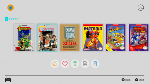
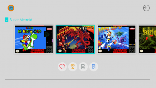
Here's a view of all the various icons. From left to right: star rating, value designated by the ticks around the star. I'm still not happy with this so it will most likely change once I come up with a better design. favorite completed broken portable These show individually according to their respective setting in LaunchBox. They most likely won't all show at once for any given game, but for illustrative purposes I have them all enabled. The controller icon in the bottom left and the buttons in the bottom right are changeable. I will include my PSD and AI files for those along with a few that i have pre-made. So far i have 3 controllers (XBox One, PS3, and PS4) and 2 sets of buttons (XBox and PS) already made ready to be swapped out with a simple rename of the file. This controller icon is indicative of what you are using, not that of the selected platform. Still to do on this view are some subtle animations to bring the UI to life, including the pulsing of the game title. On the original UI, the game title pulses in color from cyan to a darker cyan which helps readability on the background. If it's too hard to read after adding the effect, I may just make the game title the same dark grey as the various other elements. I'm also throwing around the idea of putting the platform title up top after the "user" logo.
-
No biggie, it's not a top priority. The analog clock is working and at least gives you a general idea of what time it is.
-
Personally, I'd be happy with 12 hour AM/PM with hours and minutes only (hh:mm tt)but I'd also be fine with a 24 hour format (HH:mm). If it's a text property I assume I could set the string format in the theme (like the game release date), correct?
-
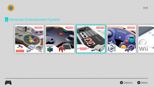
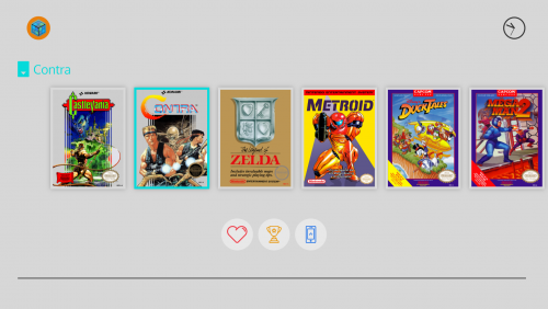
Here's a few screenshots of my current project based on the Nintendo Switch UI. For as simple as the original UI is, it is proving difficult to bring it to BigBox (at least to my liking, since I am a perfectionist), but I am slowly making progress. I have managed to include a real-time, working clock although it's analog only. Unfortunately a digital clock is out of reach unless some code-behind can be added from @Jason Carr (but he is super busy, as we all know). There probably won't be many views in this one, as the Switch doesn't have many different layouts to it's menu system, but I'll add as many as I can. The good thing is I recently got one, so studying the original UI is what I have been doing to help with replication. The Box Game view is almost complete. I still have to add the controller icons at the bottom right and a few other miscellaneous things like the star rating image. Then it's on to the other views. I don't have an expectation as to when this will be done, but I am working on it diligently. Anyways, here's the shots. The lower icons are displayed according to what you have set in LaunchBox (the star rating image will also be here when I have it finished).
- 68 replies
-
- 16
-

-
If you inspect the page you'll see that the Google Analytics code is that of Kodi.tv tracking page views.
-
Go on their Twitter...it's an April Fools joke.
-
I was also wondering, as it seems to be in most of his videos. Sent from my iPhone using Tapatalk Pro
-
Here's the example of my previous border... <Border Grid.Column="2" Grid.Row="3" BorderBrush="Red" Background="#1AFFFFFF" UseLayoutRounding="True" SnapsToDevicePixels="True"/> The border will be Red and opaque and the background will be white at 10%. You can do this with any color on any element.
-
It is indeed possible, but you have to use the hex codes for your colors with the opacity as part of the hex. Here is a list i keep of the different values... 100% — FF 95% — F2 90% — E6 85% — D9 80% — CC 75% — BF 70% — B3 65% — A6 60% — 99 55% — 8C 50% — 80 45% — 73 40% — 66 35% — 59 30% — 4D 25% — 40 20% — 33 15% — 26 10% — 1A 5% — 0D 0% — 00 So for a white background at 50% opacity it would be Background="#80FFFFFF"
-
There is no automatic way, that I am aware of, to achieve this but I did come up with a kind of hacky solution. It checks the Actual Width of the Canvas and adjusts the border size according to that value. Below is the code and some screen grabs to prove it indeed works. <Border Grid.Column="2" Grid.Row="3" BorderBrush="Red" Background="White" UseLayoutRounding="True" SnapsToDevicePixels="True"> <Border.Style> <Style TargetType="Border"> <Setter Property="BorderThickness" Value="6" /> <Style.Triggers> <DataTrigger Binding="{Binding ElementName=Canvas, Path=ActualWidth}" Value="1280"> <Setter Property="BorderThickness" Value="2" /> </DataTrigger> <DataTrigger Binding="{Binding ElementName=Canvas, Path=ActualWidth}" Value="1366"> <Setter Property="BorderThickness" Value="4" /> </DataTrigger> <DataTrigger Binding="{Binding ElementName=Canvas, Path=ActualWidth}" Value="1920"> <Setter Property="BorderThickness" Value="6" /> </DataTrigger> </Style.Triggers> </Style> </Border.Style> </Border> The 1280x720 screenshot in PhotoShop showing the thickness of 2: The 1366x768 screenshot in PhotoShop showing the thickness of 4: And the 1920x1080 showing 6: The only downside is that you'll have to hardcode the different resolutions in, but it shouldn't be that bad if you stick to the most common ones.
-
I was trying to keep this as close to the actual NES Mini UI as possible, so I don't have any updates planned right now but I am open to suggestions and will consider. And thanks for the heads up about the clear logos, I forgot I put them there. Anyways, you can just delete the ones I have in the theme folder and yours will work.
-
The OP never asked if there was a theme taking advantage of it...he asked if it was possible. Sent from my iPhone using Tapatalk Pro
-
Actually it is possible using a storyboard animation. XAML has a pretty powerful animation core if you learn how it works. Sent from my iPhone using Tapatalk Pro
-

theme CriticalZone / CriticalZone - BlueBox
Grila replied to CriticalCid's topic in Big Box Custom Themes
You're right, bad morning...I should have stayed away from the keyboard. I apologize for taking out my frustration on you. It won't happen again.- 627 replies
-
- bigbox
- widescreen
- (and 10 more)
-

theme CriticalZone / CriticalZone - BlueBox
Grila replied to CriticalCid's topic in Big Box Custom Themes
You mean you took my wheel fade code and just put it with the already existing background video.... And I believe Cid already has a platform view like this... Sent from my iPhone using Tapatalk Pro- 627 replies
-
- bigbox
- widescreen
- (and 10 more)
-
I ported this theme to EmulationStation for use with RetroPie if anyone is interested. You can read more about it here... https://retropie.org.uk/forum/topic/8894/fundamental-theme
-
The idea of the wheel isn't really to stare at and study the wheel images, it's to make a selection so I won't be making any changes to the way it's currently implemented. However, you can edit the timings in the XAML files to make the wheel appear for a longer period of time if you would like to. You'll have to edit the timings for all the animations also, as the timing is all synced to the currently implemented fade in and fade out.
-
Of course, utilize z-index and place the image under the wheel.
-
-
ComixBox Changelog: v1.0.2 (2/23/2017): - Changed all the videos to use the background video object so they would stretch to fill their appropriate spaces - Forced platform and game background videos to "On" in the theme settings file to compensate for the above change
-
I feel ya, I went through the same thing Monday. Updated to the latest beta and the problem started. I tried deleting settings, reinstalling, installing to a different directory, etc. I was pulling my hair out until I finally tried a restart and viola. Glad you're fixed! Sent from my iPhone using Tapatalk Pro




3_28_201710_30_50AM.thumb.png.4f9e258b7861c66310def81dceb399b3.png)
3_28_201710_30_52AM.thumb.png.d777f6d040cf39b65084a8036157a393.png)
3_28_201710_30_57AM.thumb.png.bdb92a32a7b6eab64aabea8a94bc2b67.png)
