Jump to content
LaunchBox Community Forums

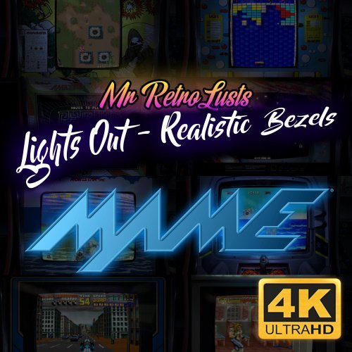
Mr. RetroLust's - Mame 4K - Lights Out - Realistic Bezels 5.9

   (14 reviews)

21 Screenshots

About This File

Note: This thread will not be pushed to the front in the "whats new" section, if you want notifications for future updates to this file be sure to follow this page by using the follow button in the upper right corner

Part of the "Lights Out - Realistic Bezels" series, for RetroArch bezels in this series see: https://forums.launchbox-app.com/files/file/1950-mr-retrolusts-lights-off-retroarch-bezels/

About:

2000 Realistic bezels in 3840x2160 resolution for MAME. My goal was to make bezels for around 1300 MAME games I had in my collection but I ended up making around 700 bezels more.

I started this project in 2019 and finished it in 2022. I used existing high quality artwork but also cleaned a lot of previously unavailable artwork which @Mr. Do had in his amazing collection. I searched high and low with google images to find existing artwork, which took me to Japanese websites oftenly using google translate and research to get to those obscure images. The quality isn't always as high but I made sure I always used the highest quality I could find. 

Note: These artwork packs are made for older versions of Mame, if you use Mame 0.226 and upwards and find these files don't work right please see this post as you need to have them in a different lay structure: 


NOTE: This original project uses a reflection and scratch layer to add a realistic effect, it defines the style of the project, this is not for everyone. But please don't request "a clean verion" as I haven't kept the layer formats for all these 2000 games, this project is what it is.

==============

Installation:

Place the zip files inside the packs in mame/artwork/ 

Also be sure to curve the screen in Mame effects, you can use the preset files I've included in the downloads but they are for an older version of Mame (0.198) so they might not work on newer versions. To learn more about effects in Mame be sure to read this well: https://docs.mamedev.org/advanced/hlsl.html

==============

Credits:

Most of the artwork used are from the most excellent @Mr. Do & the many team members: http://mrdo.mameworld.info/index.php
For NeoGeo artwork much artwork came from: http://www.neogeosoft.com/
For Flyer artwork the amazing: https://flyers.arcade-museum.com/ and https://www.flyerfever.com/
Some artwork used from: https://www.verticalarcade.com/ which has amazing vertical bezels, be sure to pay them a visit.
Some artwork used from imbord3rlin3: https://www.arcade-projects.com/threads/high-resolution-scan-database-scans-as-a-free-service.24725/

Special thanks to the following people, without them this project wouldn't be what it is: @ArsInvictus John Merrit, @Briball @cmgssilva @Orionsangel @Boz1978 @L4ZYD4NE @Manson976 UDb23 @IainSA TheGuru, Smitdogg, CAG, DrVectrex, tbombaci, italie, MAMEWorld, Ad_Enuff, UDb Raspbear, @destrowade @CKL @Thoggo @Antny @Dreamstate Andyaust

Edited by Mr. RetroLust
Added Mame effects description


What's New in Version 5.9   See changelog

Released

- Bundled all updates together to the first update pack

  • Like 34
  • Thanks 16
  • Game On 2
  • The Cake is a Lie 1
  • Unusual Gem 14

User Feedback

Recommended Comments


However, the job is also your bro, ? thanks to you for the fantastic bezels that you give us every day! Hope someone uses them these Snapshots ?


Greetings from Justin.

  • Thanks 1
Link to comment
Share on other sites

2 hours ago, Retrofrogg said:

Mind posting your HLSL settings so we can try to get the screens looking just like yours?

There already in the download menu ;) see: mame shader presets

Edited by Mr. RetroLust
  • Like 1
Link to comment
Share on other sites

Thanks man. Great bezels. 2 suggestions, don't know if you've had these before. First, the game screen tends to be stretched slightly too much so that parts are not viewable - for example, in your screenshot above for "Ashura Blaster" you can see that the text at the top is stretched slightly off the screen. Personally I prefer to have every pixel of the game screen viewable, but maybe this was a personal choice you made. Second, I find the reflections of the other arcade machines a bit intrusive and wonder if this can be toned down somewhat. For example, in the Afterburner screenshot above they are clearly visible and I find this a little distracting. I understand that this is all personal preference though and that the user can edit the stretch settings and if they want to, the bezels themselves!

As an aside, these are similar to the bezels I have made, which in turn are toned-down versions of Orionsangel's bezels. I took his, darkened the arcade machines at the sides, darkened the bezel a little bit and reduced the screen scratches/glare effect by about 40%. You can find those here (I've released 3 packs of them):

I've since started adding gaussian blur to the machines at the sides as this makes the main artwork pop even more. Your bezels seem to be a bit closer cropped in than Orionsangel's if I'm correct?

Edited by Retrofrogg
Link to comment
Share on other sites

8 minutes ago, Retrofrogg said:

Thanks man. Great bezels. 2 suggestions, don't know if you've had these before. First, the game screen tends to be stretched slightly too much so that parts are not viewable - for example, in your screenshot above for "Ashura Blaster" you can see that the text at the top is stretched slightly off the screen. Personally I prefer to have every pixel of the game screen viewable, but maybe this was a personal choice you made. Second, I find the reflections of the other arcade machines a bit intrusive and wonder if this can be toned down somewhat. For example, in the Afterburner screenshot above they are clearly visible and I find this a little distracting. I understand that this is all personal preference though and that the user can edit the stretch settings and if they want to, the bezels themselves!

As an aside, these are similar to the bezels I have made, which in turn are toned-down versions of Orionsangel's bezels. I took his, darkened the arcade machines at the sides, darkened the bezel a little bit and reduced the screen scratches/glare effect by about 40%. You can find those here (I've released 3 packs of them):

I've since started adding gaussian blur to the machines at the sides as this makes the main artwork pop even more. Your bezels seem to be a bit closer cropped in than Orionsangel's if I'm correct?

Yep personal preference indeed ;)

  • Like 1
Link to comment
Share on other sites

Sorry, I'm new to the community. But could someone upload a video how to setup these magnificent bezels on launchbox? I think they are really worth it. Thank you Mr. RetroLust for the great work!

  • Thanks 1
Link to comment
Share on other sites

6 minutes ago, manuelgzl42 said:

Sorry, I'm new to the community. But could someone upload a video how to setup these magnificent bezels on launchbox? I think they are really worth it. Thank you Mr. RetroLust for the great work!

Glad you like :) Place the zip files in mame/artwork/ and your ready to go.

  • Thanks 1
Link to comment
Share on other sites

I'tried your Bezels for my MAME Setup...what should i say....GREAT, absolutly GREAT. These Bezels made my LB MAME Setup perfect. Big Thank you for the hours, days, week you spent. 🤩 

  • Thanks 1
Link to comment
Share on other sites

13 minutes ago, Cheds89 said:

Hi @Mr. RetroLust


Is there an easy way of removing the scratch/grime layer from any of these?


Thank you!

Nope, they all have different dimensions so they'd have to be done by hand.

Link to comment
Share on other sites

Thanks for your reply @Mr. RetroLust

I love these, however, I just personally find the scratches distracting. I would probably feel the same way in front of a real cab!

Would you ever provide the raw files for this project? Are the raw files sitting in layers in a Photoshop file?

Thanks,

Link to comment
Share on other sites


Join the conversation

You can post now and register later. If you have an account, sign in now to post with your account.

Guest
Unfortunately, your content contains terms that we do not allow. Please edit your content to remove the highlighted words below.
Add a comment...

×   Pasted as rich text.   Paste as plain text instead

  Only 75 emoji are allowed.

×   Your link has been automatically embedded.   Display as a link instead

×   Your previous content has been restored.   Clear editor

×   You cannot paste images directly. Upload or insert images from URL.

×
×
  • Create New...