


About This File
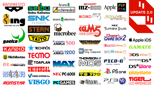
This is a giant collection of platform logos drawn digitally by hand. This took well over 500 hours of work over 15 months. While console logos exist all over the internet, this collection aims to bring them to a higher level of polish and accuracy. The default logos in BigBox will now come from this set. It was extremely tedious to ensure a very high level of accuracy across thousands of files.
So Many Versions!
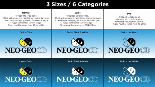
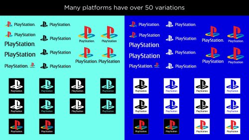
Each included platform has multiple logo variants. Basically, many consoles had different logos for different regions and time periods. There are also smaller variations such as with or without a trademark (tm). There are black and white versions for each of these. With all of these it can add up to over 50 small variations for one platform! This would be impossible to navigate so I’ve split them up into smaller categories. For each format (Normal, Large and SVG) there are Light and Dark folders. For either of those there are: “Color”, “Black & White” and “Just White” (or Just Black respectively). If you wanted to use a minimalistic dark theme, you could use the “Just White” versions for a contemporary look. If you wanted logos for a standard dark theme then you could use “Light - Color”.


Official Versions Included
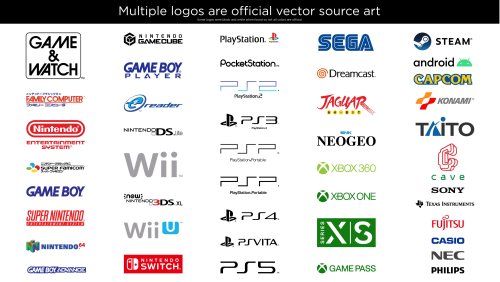
Besides the many hand drawn logos, I’ve also curated multiple logos that are the OFFICIAL renderings. Meaning, vector art ripped from official sources such as websites and pdf manuals. Finding official source art in the wild is pretty uncommon and required many hours of digging. Most of the source art was not in color so most of these colors are still generated by me. Some of the platforms with official logos include:
Android modern logo (from Android website)
Apple IOS (apple.com current site and I think 2014 in the Wayback Machine if I remember right)
Atari Jaguar (from an official game box template) (extremely rare to see)
Capcom Logo with official color (various arcade manuals)
Casio Logo (from Casio Website)
Cave Logo (from Cave website)
Eighting Logo ( EIGHTING Co., Ltd. (8ing.co.jp) )
Fujitsu logo (from Fujitsu website)
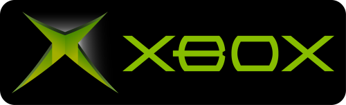
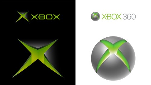
Microsoft Xbox (one color icon), Game Pass, Series Logos (from Xbox website)
NEC logo (from Nec website)
NES/Famicom (from NES/Famicom Classic website)
Nes, Famicom, SNES, Super Famicom (from Nes, Famicom, SNES, Super Famicom Classic websites)
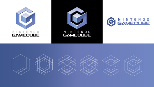
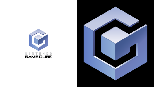
Nintendo Gameboy (bold version), Gameboy advance, Nintendo Gamecube (one color version), Nintendo DS/DSi, (New) Nintendo 3DS, Nintendo Wii, Nintendo Wii U (from vector manuals)
Nintendo Switch (from Nintendo website)
Nintendo Various eShop logo’s (respective vector manuals for each system)
Phillips Logo (from Philips website)
Playdate ( https://play.date/ )
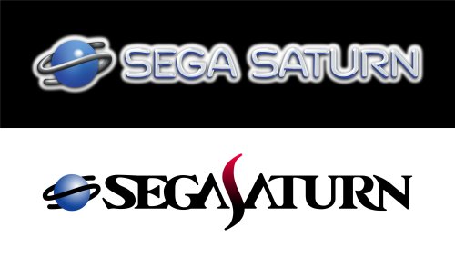
Sega Dreamcast logo and PAL blue color and blue of Sega logo (from official Sega press disc from 1999)
Sega Logo (from Sega Japanese Website)
Sony PS modern icon (from PlayStation website)
Sony PS1, 2, 3, 4, 5, VR, Vita, PSP (from vector manual)
Sony PlayStation 1 colored symbol (from PS1 vector service manual)
Sony PlayStation 3 Network (Partially official, words official and symbol was official but seemingly compressed so I cleaned it up a bit)
Sony Pocketstation (from vector manual) (Same as Wikipedia)
Texas Instruments Logo (from TI website)
Various SNK and modern Neo Geo Logos (from SNK 40th anniversary Japanese site)

Sadly, some of these wasted a lot of my time because I drew them and later found the official versions.
The Drawing Process:
My process for drawing a logo required many steps. I first did research on each logo. Then I would dig deep for the best references I could find. One rule I had was to never trust any image. I would compare multiple sources and make sure the source I chose was not fan made or some modern re-release that changed the logo. If a better source was found that showed differences from what I drew I would redraw it again (it sucked). I redrew the NEO GEO logo about 5 times before I was finally happy with it. Generally, source art would include box art images, adverts, brochures, and manual scans. Archive.org and Manualslib.com were a huge help for a lot of these scans. I would then use the pen tool in Adobe Illustrator and go to town! Sometimes if my source was really amazing, I could finish the whole logo in an hour and a half or so. Other times it would take much, much longer.


Getting the correct color was always challenging and required intelligent guesswork. For example, with the classic Konami logo, I brought in 20 images. Gathered the color from all of those and found the average color for the red and orange. Then I’d tweak it slightly more, usually to improve saturation.
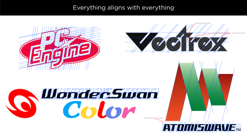
When it came to fonts, I would always search for it but rarely found exact matches. If the font was found I’d obviously use it, but If not I’d have to hand draw it. However, a couple of the smaller taglines/subtitles do use a very close match. Hand drawing those fonts would do more harm than good. While drawing a logo I took great care to make things as visually pleasing as possible. Every little section of each letter of each logo was considered. Curves were carefully made to be smooth with as few anchor points as possible. Letters align with each other and angled letters all share the same angle. Hand drawing fonts is very tricky.

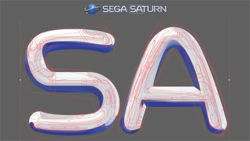
![]()

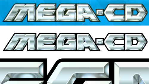
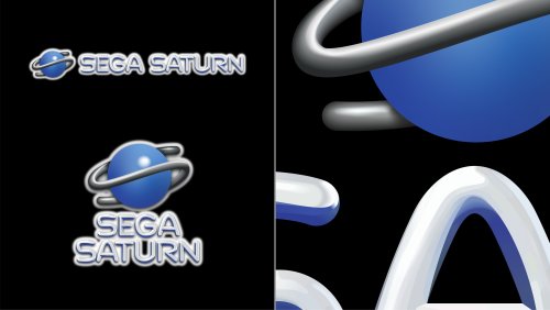
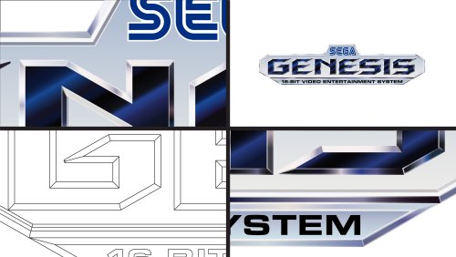
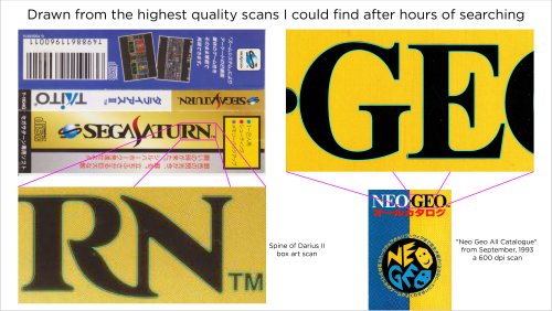
Many logos were substantially harder than I’d anticipated. The Sega Saturn US logo for instance, drove me insane. It took over 40 hours to draw (not to mention wasted time from failed attempts months earlier). I used Adobe Illustrator to mimic every highlight, tiny color shift, shading and glow. When I was working on this logo, I’d come home from my graphic design day job and then spend 4 hours on it, which would only finish part of one letter. As I worked, I’d have a couple copies of the logo in the same file and a couple times it bottomed out 32GB of ram!


Unique Versions
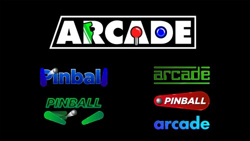
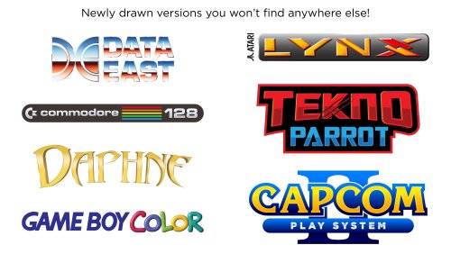
This collection brings a few unique logos to the table. I’m just going to list a few. I created multiple new arcade and pinball logos, although previous arcade logos are here too. I highly polished the Daphne logo as it needed some love. I drew a detailed version of the TeknoParrot logo which seems to be uncommon in high resolution. I also created Sega system 16 and 32 arcade logos based on the exact font used in the Sega 32X and Sega CD (Copperplate Gothic Std 31AB stretched horizontally to 130%). The Capcom logos have stylized alternate versions based on a gradated version Capcom rarely uses. There are several other unique logos I could list here.


White Outline - Default Versions
Since these logos are replacing the default logos in BigBox, Faeran smartly requested that I create versions with white outlines around the outside. That way logos could be seen against any background color. I only made the outline versions for the options I gave to Faeran. I don’t plan on making outline versions for the rest of the variations. That said, the versions I did make are included here. The outline versions don’t look quite as nice in my opinion but they serve a very functional and important purpose. Solid black logos for some systems, like the PSP, would not be visible in certain themes without a white outline. However, theme creators or those wanting to add logos to a single theme, I would still recommend the non-outline versions for the cleanest look.
Conclusion
I included every platform and version that I wanted to. There are some more obscure ones I could draw but I didn’t see the need to seeing as how I've created 22,000 files as is. If I knew how much work this was going to take, I would've never gotten myself into this (lol). I hope that you guys get a lot of enjoyment out of these. I’m glad I made them and it feels really good to finally be able to upload them. I made these originally for LaunchBox but they can be used elsewhere. I will always appreciate credit if you use them. Needless to say, I don’t own the rights to the logos and these are NEVER to be sold in any way.
Thanks
Special thanks to Juketstu and Faeran for their valuable feedback.
Also, huge thanks again to Faeran and the LaunchBox team for using these as the new defaults for BigBox!
If you like what you see here, please also check out my LaunchBox / BigBox logo collection & Pineapple Graphics' Photoreal Controller Vectors:


Edited by Dan Patrick
What's New in Version 2.1.0 See changelog
Released
Version 2.1
A minor update adding a small handful of new additions.
Update Features
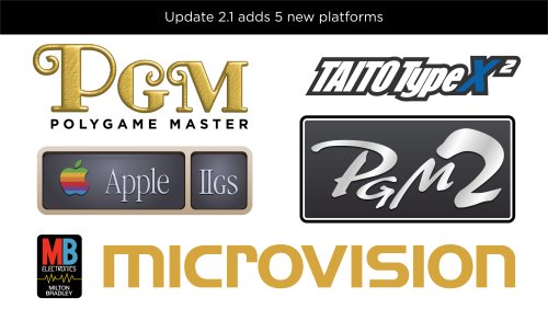
• 5 new platforms
-Apple IIGS
-Milton Bradley Microvision
-PolyGame Master
-PolyGame Master 2
-Taito Type X 2
• Added document explaining how to add logos in LaunchBox
• Added missing white outline versions for Xbox Live Arcade
• Added Sega Saturn Japan option for recommended versions
• Added new light color variant for Taito Type X
• Added white outline versions (1 per platform) to recommended versions
Total number of platforms covered after this update
Arcade 59
Computers 65
Consoles 86
Handhelds 35
Total 245


Recommended Comments
Join the conversation
You can post now and register later. If you have an account, sign in now to post with your account.