

damageinc86
-
Posts
1,439 -
Joined
-
Last visited
-
Days Won
2
Content Type
Profiles
Forums
Articles
Downloads
Gallery
Blogs
Everything posted by damageinc86
-
Will you be releasing a full pack of these?
-
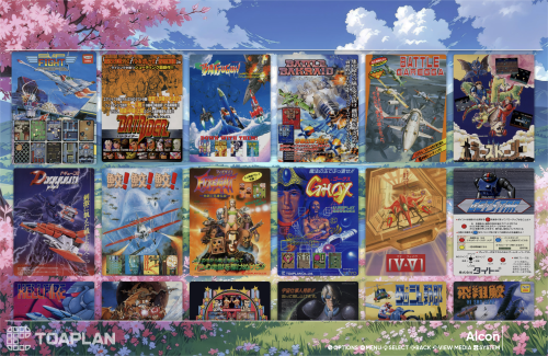 Well apparently I needed a good advertisement flier for Battle Bakraid, so I appreciate you sharing this!
 -
 This is just wild. We have enough phenomenal HQ cart, box, whatever else SETS made by the community. I feel like LBDB (staff, or whomever) should just grab those sets, rename appropriately, and have those as the defaults and then lock it. Option stuff can be added by the user after that, or given a choice: Default LBDB HQ set (community username contributor) , or Fanart cart random.
 -
There's some other cool scenes that the pixel artist has on their youtube page. https://www.youtube.com/@waneella/videos
-
Maps and text passwords - What do i do with them?
damageinc86 replied to Shredder_guitar's topic in Game Media
the superpausemenu plugin has folders you can place the manuals in and they'll show up I think. -
 @faeranCould you please release the 2.1 CTC files so we can edit transition times?
 -
Big Box Theme Templates to Spark More Creativity?
damageinc86 replied to drtechnolust's topic in Big Box Custom Themes
Were you able to find the spot for the selected game animations enter delay? or whatever it would be called lol. -
This type of game is what I wish someone could do to my characters and game idea I have. But it's so much fucking money to hire devs. I love this style of game. and schmups too.
-
Big Box Theme Templates to Spark More Creativity?
damageinc86 replied to drtechnolust's topic in Big Box Custom Themes
no nothing productive came from the gpt journey lol. I think it may have helped with the platform views, but the games view is still SLOW entrance of details. I can't send on discord because it pops up some file limit message about nitro. So maybe you could just get the theme from here: It's BAnnerBox 2.1 -
Big Box Theme Templates to Spark More Creativity?
damageinc86 replied to drtechnolust's topic in Big Box Custom Themes
how about you prod? could you look at the BannerBox .xaml files and find where the values are to change the delay on details entering once a game is landed on? it takes WAY too long for the fade out and theme elements to begin to slide in and populate the details -
Big Box Theme Templates to Spark More Creativity?
damageinc86 replied to drtechnolust's topic in Big Box Custom Themes
ok i searched for 3 seconds as an example. i got anything that had the number 3 in it lol. including grid height "1080 Width "384" . so...still don't know where the value for delaying the game details coming in would be. -
Big Box Theme Templates to Spark More Creativity?
damageinc86 replied to drtechnolust's topic in Big Box Custom Themes
Yeah i don't know where to look. and apparently chatgpt can't figure out what values to edit either. I need the banner box details to fly in(transition) quicker. It takes too long after you land on a game for eveeything to come in. -
Big Box Theme Templates to Spark More Creativity?
damageinc86 replied to drtechnolust's topic in Big Box Custom Themes
Well, I just wasted over an hour trying to explain to chatgpt what to do, and the game select fade-out and details transition in for BannerBox theme still is slow as molasses. It could never figure it out lol. -
Thunder Zone and Crackdown marquees, and others
damageinc86 replied to Speeddog's topic in Game Media
interesting takes on these. What are you using? -
Big Box Theme Templates to Spark More Creativity?
damageinc86 replied to drtechnolust's topic in Big Box Custom Themes
Could you look at the BannerBox theme code and help me get the details/game name screen to slide in quicker than it currently does? That's all I want different in the theme. It takes WAY too long for all the details to slide in and populate once you land on a console or a game from the list. -
Is there the ability to map BB navigation controls on a per-controller basis yet? Asking for a friend lol.
-
Thunder Zone and Crackdown marquees, and others
damageinc86 replied to Speeddog's topic in Game Media
Thanks for these! -
Why not just put them all in a mega.nz link to supplement the thread then?
-
And per controller navigation mapping?
-
Install 90s Jetfighter Simulations on Windows 11
damageinc86 replied to Anthony Bartens's topic in Games
I'd put anything DOS, through retroarch Dosbox pure core. -
I don't see any presentation in their screenshots that uses a clear logo for the game? Are there any views that do at least have clear logo, box art, and other basic artwork pieces for the game? I wouldn't really want to go back to just plain text game lists. That's the entire reason why I'd want to use a front end. Also curious, are you able to map each one of your controllers independently for navigating the front end interface? Launchbox still just applies one button set to all controllers you have plugged in for navigating big box. Which leaves you guessing as to which button on which controller is going to start the game, or move back, etc.
-
This should be the way to edit where platforms are nested. But I don't see why deleting say,...NES out of the consoles category, would cause any other console platform to go anywhere. That's odd.
-
Ahhh yeah ok, if it is that new, then perhaps it was added, and the core is just too old. And I don't think they are planning on releasing a newer version of the core anytime soon either. Especially since it was taken down altogether from their official offerings. That's too bad. I think the only option is to point LB to the standalone hbmame for that particular entry then. Which will be a mismatch in presentation if you are using the mega bezel reflective shader for the rest in retroarch.
-
My HBMAME romet doesn't even have an mk3.zip in it. I downloaded this romset, and HBMAMEUIFX when it was version 0.174. I was under the impression it was a nice full romset at the time. So I'm not sure if I'm just missing that one, or if yours has that for some reason? I haven't been able to find any information on a Mortal Kombat 3 HBMAME romhack either. So I'm really not sure what is happening here. I found a .211 HBMAME romset on internet archive, and that also does not have an mk3 rom in it. I'm beginning to think that someone just included an mk3 rom in your hbmame romset? I dunno.
-
yes, shows it as .220 mame hbmame_libretro.dll


