
viking
-
Posts
965 -
Joined
-
Last visited
-
Days Won
30
Content Type
Profiles
Forums
Articles
Downloads
Gallery
Blogs
Everything posted by viking
-
OK. Time for a concept update. 🚀 As a reminder: v3 of the theme has not started its development! Still in the concept and Photoshop mockup stage. I take this opportunity to thank you for your feedback. Even if I don't include them all, they are all useful! Sorry in advance: this is going to be a long post! PLATFORM : I've done a lot of them. Much more than the 4 view limit. I really hope this limit will be lifted by a future update! 🤞 ( @Jason Carr ) PlatformWheel1FiltersView Video background. The original view, modernized. PlatformWheel2FiltersView Video background. Same, with wheel always visible. I don't think it's useful. It will probably disappear... PlatformWheel3FiltersView Video background. The original view, modernized. It is really this variant of "box" design that I prefer =) PlatformWheel4FiltersView Video background. The same, in dark design. I would like to merge the 2 versions (lite + dark) into one theme. It would be much easier to maintain! PlatformWheel5FiltersView PNG hardware. Views to take advantage of the new wheel. Dark version. PlatformWheel6FiltersView PNG hardware. Views to take advantage of the new wheel. Lite version. PlatformWheel7FiltersView Views to take advantage of the new wheel. PlatformWheel8FiltersView PNG hardware. Just some adjustments on my favorite view. No video. No centering. Just simplicity! I started to make a logo set for the manufacturers, but the ratio is not always good. And some are impossible to get in good resolution. So a large text in the background seems more consistent. PlatformWheel9FiltersView PNG hardware. Another quick test. =) Quick and snappy UI. PlatformWheel10FiltersView (or TextPlatformView if it's possible ?) PNG hardware. Big bold text and that's it ^^ Love this one to ! GAMESVIEW OK, let's see what we can do with the GamesView. Here, no problem of number limit! WheelGamesView Video Background Legacy view, modernized. To avoid having to manage a lite and dark version : we switch to color ! Wheel2GamesView Fanart or gameplay image background. A very simple view. The idea being to privilege the speed and the ergonomics of the interface. HorizontalWheel1GamesView Modernization of an old concept. HorizontalWheel2GamesView Modernization of an old concept. Small game with the cartridge front and the new wheel. HorizontalWheel3GamesView More "TV" style. Like Netflix. Not sure here =/ HorizontalWheel4GamesView More "TV" style. Like Netflix. I prefer this one! WallGamesView Modernization of an old concept. Wall2GamesView Modernization of an old concept. Wall3GamesView Really not sure about this one. Too few items visible on the screen. Video on the top right. The most difficult one will remain: TextGamesView Not easy because it is the funnel. Everything ends on this view ! I look forward to your comments! Thank you for reading to the end

-
OK, little update on my concept, based on your feedback. Only PlatformView again. Attention, I have deleted one of the previous ones. So new name for the views. @Jason Carr @faeran @y2guru and all the community : What do you think of all this? Are there any things that are impossible? PlatformWheel1FiltersView Video based view. Just a little bit of cleaning here. PlatformWheel2FiltersView Video based view. Same. Just a little bit of cleaning here. I'm not sure this view is very interesting. Its only advantage is the permanently visible wheel. So less animation. So more reactivity. What do you think about it? PlatformWheel3FiltersView Video based view. OK. Here I tried to keep the original spirit, while modernizing and simplifying the view. I like it ! Your opinion? PlatformWheel4FiltersView Video based view. The same, in dark version. PlatformWheel5FiltersView PNG based view. Just a little cleaning. The idea here is to play on the new possibilities of the wheel. A variant around the navigation "Banner" style. Maybe it's too heavy. I hope it will stay fluid. PlatformWheel6FiltersView PNG based view. Same in light style. With a random blurry Gameplay image in background. Desaturated and low opacity. PlatformWheel7FiltersView PNG based view. Or maybe video. (Will depend on the final fluidity) I like the principle of this one. Banner style too. But it lacks a je ne sais quoi. I still have to work here! PlatformWheel8FiltersView PNG based view. Small adjustments on the presentation of PlatfornName + Date + GamesCount. I really like this one. But I still have to do better on the titles... I'll think about it ! PlatformWheel9FiltersView PNG based view. I totally redesigned the old view 10. For the color by platform, the idea is a fade color to color, when we change selection. Fast, like <1sec. Technically, I don't know which is better: - Based on TextPlatformView ? - Based on PlatformWheelView + Custom wheel item ? The idea here is to play with an ultra bold platform list. I hesitate between two versions: - Unselected : bold outline font ? - Unselected : bold font ? Thank you for reading everything! Your feedback is precious to me! Don't hesitate to give your opinion in detail!
-
Thx! =) Thx! PlatformWheel3FiltersView : I think you are right. I wanted to keep the roots too much. But it's time to modernize it. And on this style of interface, no one reads the summary anyway! ^^ PlatformWheel9FiltersView : Integrating the video will create too much compromise on this view. I will refine it because I will have to see how this view behaves with short manufacturer names (like SEGA) Yes, that's the goal I have in mind for this v.3: to clean up as much as possible while keeping the elegance. Thank you all for your feedback. I'm going back to work on my concepts =)
-
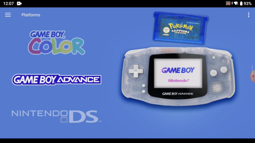
OK guys. It's time to show you some of my concept for the v.3 theme ! But first, a quick review of the current version: Too much animation! It's too slow, not very reactive and finally, we don't take take time for play videos. For this v.3, I want to simplify all that. Animations: yes. But under 1sec maximum. Trying to join the theme color with the video color is too painful. So I changed the design to avoid that. So, if there is a slight variation between the 2 colors, it will be invisible. Or at least not annoying. I am annoyed by the limit of PlatformView. Only 4 today and all with wheels. Ideally, we should have the same number and diversity as for GamesView. (box, wall, coverflow, 3D) I already asked to @faeran who is passing on to @Jason Carr and the team. But his is a limit I have to deal with for today. Having a light and dark version is painful to maintain. If the limit of the point above is lifted, we can have only one Colorful theme. Which includes both light and dark views. Some v.2 designs have already aged I think. There may be other things to say! Do not hesitate to tell me in comments OK, now let's talk about v.3 I would like to address each of the following points. Originally, I design this theme for TV. Since then, I have an Odin and I really like to stream all my content on a handheld, including BigBox. So I'll include this aspect in my design. The first thing is the footer bar, inspired from Retroarch. I really like its simplicity and elegance. So you're going to see a lot of concept. For now, these are only photoshop mockups. There are too many of them. Not all of them will be developed and I'm not even sure if some ideas are possible in code. In any case, I have to wait for the v.2.5 of the Community theme Creator by @y2guru to hope complete all that ^^ I will try to explain the concept of each of these views. For today, I will only present you PlatformViews. And remember: nothing here is fixed yet. It can change! Let's go ! PlatformWheel1FiltersView : A legacy colorful view. I really like the original view, but it's a pain in the b... to adjust colors between video and theme. Here, the video is alone: no more problem! The selection wheel will be in the same spirit as the current one, but much simpler and with a faster animation. PlatformWheel2FiltersView : Same type of design as #01, but without details. The wheel is permanently displayed. I don't know if it's possible, but I would like to place the wheel straight, but with an angle, following the structure line. Not rounded. PlatformWheel3FiltersView : Legacy colorful view again. Identical to the original, but slightly modernized. The selection wheel will be in the same spirit as the current one, but much simpler and with a faster animation. PlatformWheel4FiltersView : The same, but in dark version. Possible to merge the 2 versions (light & dark), if we can inclued more than 4 PlatformView. ( @Jason Carr ) PlatformWheel5FiltersView : OK, let's start the new concepts for Colorful! The idea here is to use the power of custom wheels. Thx @y2guru ! Here, the "Nintendo NES" block is selected. The other blocks are not. Finally, there is "only" the wheel displayed on the screen (or almost) Here, it is not the video that is displayed, but the PNG set. Here in dark. PlatformWheel6FiltersView : Same, but here in light. PlatformWheel7FiltersView : Here, it is not the video that is displayed, but the PNG set. This gives much more freedom with the transparent background. I'm not so sure about this view. Probably too loaded for the Colorful dna. I still have some work to do on this view! PlatformWheel8FiltersView : Again the PNG set and again a giant wheel. In this example too, it is the NES that is selected. PlatformWheel9FiltersView : I really really REALLY like this one. Really in the Colorful spirit and much more modern. Again, no video, but the PNG set. Vertical wheel. There is only the Hardware PNG in the wheel and you can only see the selected item. The counter at the bottom right allows you to find your way through the navigation. The background makes a color fade between each selected platform. PlatformWheel10FiltersView : Another test, always with the PNG. A kind of great general mix. Here, the wheel is on the left. Long colored rectangle for the selected item. A small grey for the unselected ones. That's all ^^ Random GamePlay image, desaturated, masked and with little opacity. All "platform color" fade between each selection. I don't know if this view is possible. The wheel should work differently here. The selected item should not stay in the center, but go up and down. It is the total list that is fixed. That's it for today. This gives you an idea of the direction the theme will take in its next version. It doesn't look like much, but it's a lot of work!! I hope you like it! What are your favorites? Do you have any suggestions? Any ideas? Thank you for reading this to the end
- 787 replies
-
- 11
-

-

-

-

-
 Not at the moment. But I'm thinking of making a custom image set for the original "Platform Banner" theme. For GamesView, I recommend "Pure" by Faeran. yes : On the theme download page, you'll find the sources to modify the theme in the Community Theme Creator. I am currently working on the v.3 mockups =) I will also integrate the start and pause theme. Yes, an oversight. I will add it for the next update OK, I'll think about it =) It will be difficult. On the theme download page, you'll find the sources to modify the theme in the Community Theme Creator. In the next version, I'll try to simplify everything, with the same DNA. OK!
 -
 Yes, you are right. And it's my fault: I didn't keep my platform list up to date and I worked on some that had already been done by the community... So, these 3 platforms have 2 versions. So a problem of consistency. Right now, the easiest way to fix your problem: From the LaunchBox platform download tool, download these 3 platforms again, choosing my version ("viking") in the dropdown menu. In the future version (v.3) of the theme, I will rethink all this. It's too restrictive the PNG/Video and color alignment. I'm currently working on the Photoshop mockups of the next view. As soon as I'm happy with them, I'll show you all this on the forum
 -
 Hi @PurpleScientist, It was not me who developed Daijishou. He only uses my artwork. I don't know what size and image ratio is used by this Android frontend. But you will find what you are looking for here: - Colorful Video Set thread : With each new video, I post a JPG file of the platform in 4K. You can browse these pages to find these 2 platforms. - Colorful Hardware PNG set : This is a release in transparent PNG format and square ratio, of all my set to date. You can find these 2 platforms. It's up to you to add a background and to crop them to the format you want.
 -

Photoreal Controller Vectors by Pineapple Graphics
viking commented on Dan Patrick's file in Platform Console Images
 Nice!!! Big thx for sharing your amazing work!! 👍
 -
Wow, nice bezel !!!
-
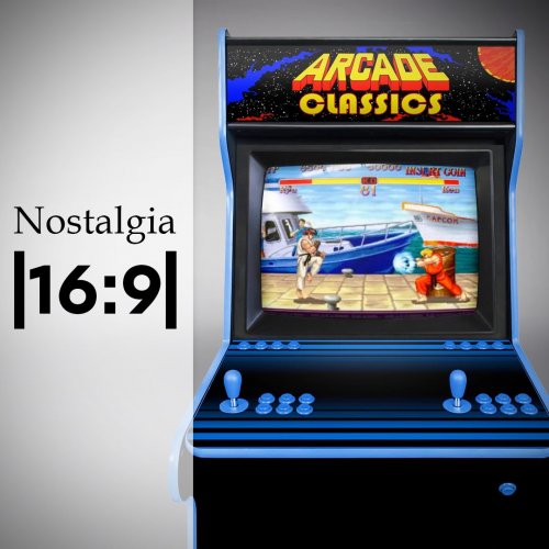 Sorry, I did not keep any source of Nostalgia ... yes, I know, no need to say it ... But ! You can use the complete sources I put online for Colorful. And redo the video with the Nostalgia background here :
 -
@soqueroeu Yes, you are right. In fact, this view should not even be active! It's a work in progress that I had coded/tested before Faeran redid the code with the Community Theme Creator. Here is my original Photoshop mokup : About the theme development, I have tons of ideas that are currently maturing. I'm especially waiting for the next release of CTC with all the wheel options. Please be patient : there will be beautiful things to come!!!
-
 Oh, OK! I hadn't seen that at all! Other solution: - You keep the original video set. - Shift the video to the right. - Fill the space on the left with a color in the theme. Like we do on Colorful in fact. You spend more time on the theme code, but less on modifying existing videos. Check out the Android "PURE" theme by @faeran. Open the GamesView in a texteditor. He added the code piece to add 1 color per platform. Covering Android compatible platforms will be faster than the one for Windows. So, no more compatibility problems with my video set ! (Note: I've never coded theme for Android. No idea if it's possible or not)
 -
I haven't tested this theme yet, but I don't know if it's really necessary to use the archive embedded videos. From LaunchBox android, you can download the Colorful videos directly. The full set is available.
-
@Bawnanable Cool ! Of course, you can share your work! I would test this on my Odin too
-
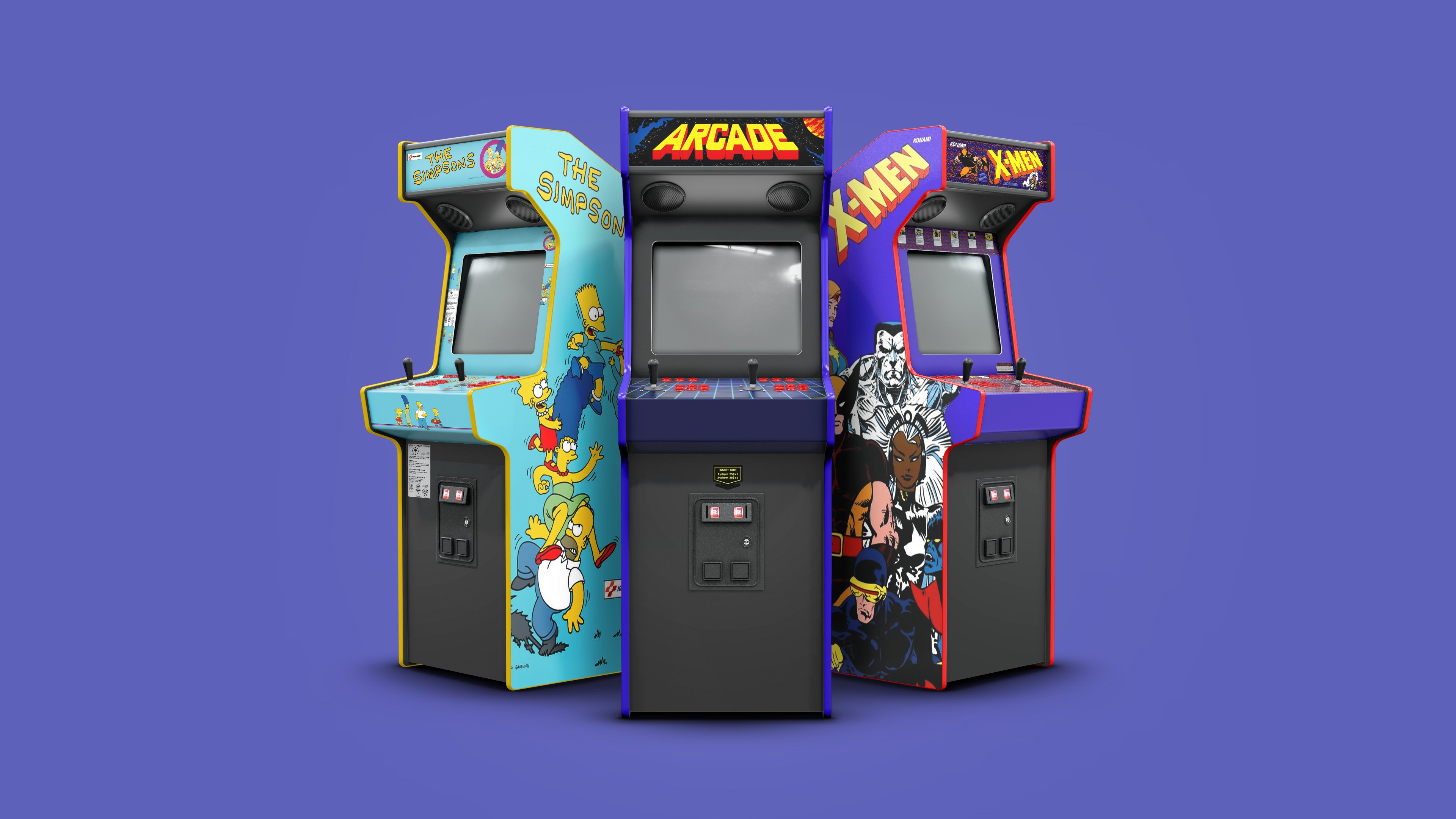
Thx @KitKatarama ! Yes, Sega Triforce was planned. But it's a big one, with custom and big cabinet. I must do all this in CGI before!
-
The easiest way is to copy/paste a view.xaml from v1 to v2. But there will probably be incompatibility with the color management system per platform. @faeran , for this v2, has totally recreated the theme with the Community theme Creator (you can find the sources on the theme download page). Like removing the "hardware.png" from the wheel. Or customize/add platform colors.
-
Yes, you're right! @tiualex I can't find the sources for your POKEMON MINI platform. Can you send them to me again? Thanks!!!!
-
A GOG video is planned. It will be part of the "Windows" platform option. I already made a few. - Windows 3.1, 95, 98, 2000, XP ... - GOG, Steam, Origin, GamePass, ... For the Nintendo playlist, I don't think so. If I start working on specific playlists, it's endless. I will only make the general playlist that reaches the maximum number of people (Arcade + Windows) Yes, I had initially set up a list on the video download page. But it's too painful to maintain, so I deleted it. Is it really useful ?
-
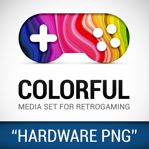
media pack COLORFUL Hardware PNG media (1x1)
viking commented on viking's file in Platform Media Packs
 Thx @Retrocop ! To answer you: Size change: You're right! I had to crop too quickly. I'll go around and correct the set. WiiWare version : Good idea! I'll see what I can do. Handheld : Well, no. Basically, I created this set for a transition effect with the videos on all the PlatformViews of my theme. The images and videos should be perfectly aligned. In the videos, I added the handheld cartridges. But I removed them on the PNG's because it would limit the usage: No image elements should be cut because the usage would be limited in other theme/circumstance, due to the transparent background.
 -
With pleasure @OdinsPlayground ! When you have time =) Nope, no Namco System 11 for now. Currently, I am working on the v2 of Naomi(s) CGI. With the right arcade cabinet design. Thx @Klopjero for the 3D model link ! Maybe other systems already done, deserve a major upgrade too with this design? Here is the preview: Sega Naomi (v2) (WIP) Sega Chihiro (v2) (WIP) I'm not sure about this one. The OutRun2 terminal seems to fit this platform, but I'm not sure if the Chihiro's have mainly this form of cabinet. What do you think about it? I have preserved the background colors already in place.
-
Thanks for your feedback. @faeran, I update our Google Sheets. NEO GEO CD > OK, noted and corrected in the next theme update. Taito Type X > OK, noted and corrected in the next theme update. Amstrad CPC > Damn, I see the mistake! There are two video versions here. By CMOSS and by me. The color is adjusted on mine! It's my mistake. I will correct this. In the meantime, download mine. Commodore Amiga CD32 > OK, noted and corrected in the next theme update. But almost perfect color match already at home. Mattel Intellivision > OK, noted and corrected in the next theme update. MSX / MSX2 > Damn, I see the mistake! There are two video versions here. By Tiualex and by me. The color is adjusted on mine! It's my mistake again. I will correct this. In the meantime, download mine. Nintendo Pokémon Mini > OK, noted and corrected in the next theme update. Sammy Atomiswave > OK, noted and corrected in the next theme update. Sega Genesis > OK, noted and corrected in the next theme update. Be careful when downloading. There are 3 versions of Genesis/MegaDrive/MegaDrive Jap Sega Naomi > OK, noted and corrected in the next theme update.
-
media pack COLORFUL Hardware PNG media (1x1)
viking commented on viking's file in Platform Media Packs
Not really. This PNG set is already integrated in Colorful theme. (wheel preview in all platform view) And there are resources to create videos. I posted this set to make it more visible. Maybe it can help other theme developers (in LaunchBox or BigBox)? Or maybe unify the LaunchBox Games Database design? In any case, for those in a hurry, it will allow to update this part of the theme more quickly. -
Damn, OK Faeran! =)
-
Yes yes, excuse me, I always have trouble transmitting my ideas in English =/ Even without any animation, it would be cool! Unless I didn't understand: switching from BoxArt to Video is already an animation? Even without any "visible graphic" animation?
-
No real need for animation in this case, I think. A quick fade would be fine, but even without animation, it's nice to have a video preview before launching the game.


