
Retrofrogg
-
Posts
1,383 -
Joined
-
Last visited
-
Days Won
8
Content Type
Profiles
Forums
Articles
Downloads
Gallery
Blogs
Everything posted by Retrofrogg
-

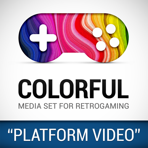
video set COLORFUL platform video set
Retrofrogg commented on viking's file in Platform Theme Videos
 Any chance of a GOG (Good Old Games) playlist video, and a Nintendo (console collection) category video?
 -
@Drybonz I have been having this issue with the normal game details view; I mentioned it some months ago. I think Faeran attempted a fix, but it's still happening. Looks like the same issue is affecting the platform details view.
-
Yes, I always edit the code to fix this problem too. I don't know why it isn't set that way by default? Who would want to see those black boxes?
-
This is awesome! Any chance it can show the platform video too?
-
@Beatlemaniac19 check the latest LB community poll -
-
Nintendo Famicom (2D Carts) [ArcDragon]
Retrofrogg commented on Arcanthur's file in Nintendo Entertainment System
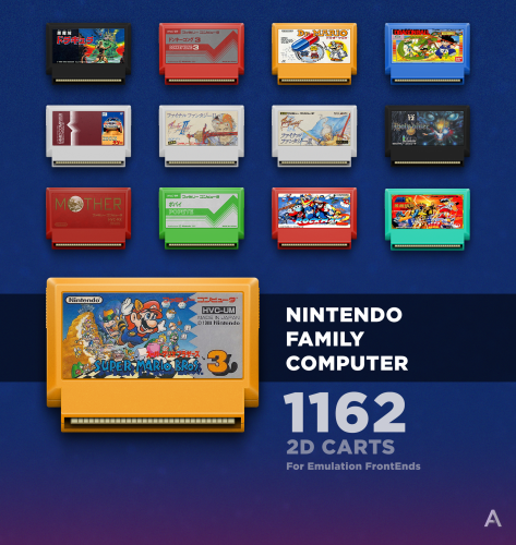 Looks good, but the bottom bit looks like it's sticking out at a funny angle. Maybe that can get straightened?
 -
 Always good to see 2.5D sets! The CD template quality is a little low however - if you like, I could share a photorealistic CD template with you which you could run through photoshop to convert these as a batch.
 -
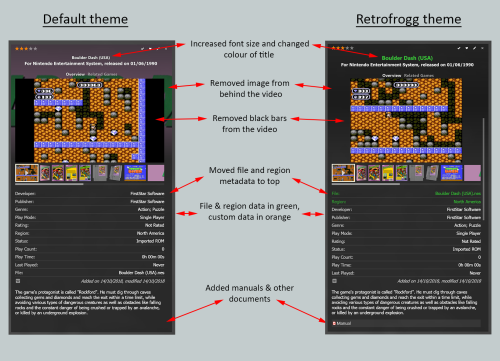
I thought I'd start up a thread in relation to this exciting poll item so that the feature can be further discussed, as there doesn't seem to be a thread already. The poll item is #5 - Platform Details within the Game Details panel - (If this feature were to win, LaunchBox would display platform metadata and media when a platform is selected, and a game is not). This is going to be a great addition to Launchbox and for me is the best of the current poll items. Currently the vast majority of the focus in Launchbox is on the games, with the platforms only being represented by their name in the platform tree. In BigBox we can see the platform details with most themes, but so far Launchbox has not allowed this; to see the platform details in Launchbox currently you would have to edit the platform. This new feature would allow platforms to be browsed properly, not just games. Given that the plan seems to be to display both metadata and media, hopefully the platform videos and images can be shown, just like game videos are. It could be themed to allow some great ways of displaying the platform videos and associated platform information. Great for the collectors and info geeks amongst us. Hopefully it would lead to some expansion of the information that could be entered for platforms. For example, as well as an image of the platform itself, it would be great to have images of the controllers, the original box, etc. In terms of where this information will appear, the poll item suggests that it would appear in the Game Details panel. This would certainly seem the easiest way to implement it - but given that the Game Details panel tends to be a relatively thin panel at the side of the screen, it would seem preferable to display the platform detail in the main window - perhaps without any separate panel being present.
-
Good idea to sort platforms by console/platform generation. Is it possible to add custom metadata for platforms, like you can for games? Then you could add the "generation" field to each platform and populate it. It would be great if Launchbox could then sort platforms when in platform category view by generation (without us having to do it manually).
-
I would be interested in using 2 screens with Launchbox, let alone 3!
-
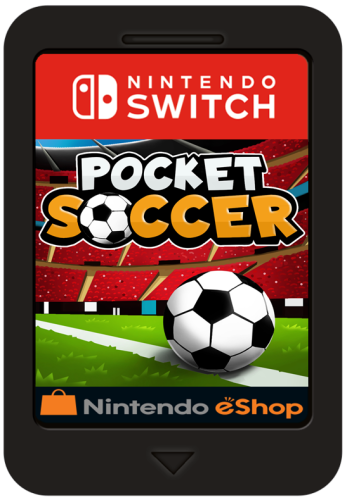 8711 Switch games! How many of these run well emulated?
 -
Adding them to the Windows platform is an option as some of the games run in Windows, though as you point out some are exclusive to the VR headset. Oculus can run independently without connection to a PC/Windows. Also, the games are fundamentally different due to being VR and requiring a VR headset. I therefore think that having a separate VR platform in the database would be the optimal way to categorise this, rather than fusing them with the existing Windows platform. It would be possible to further split the VR platform into Oculus, HTC etc, though given the cross-platform compatibility I don't think this would be necessary. Obviously this is open to debate. Would be keen to hear the devs views.
-
Bug, but I'm not sure how far along the beta chain it manifested. I import an image for a game and save as a particular image type. In Windows I then download a different image for a different game to the same folder though with the same name, overwriting the previous image. When I drag that new image into the Images section of the game edit window, the thumbnail shows the previous (wrong) image. If I click OK, then the correct image shows in LB. So the end result is OK, but it can be confusing when the wrong image appears when dragged in to the edit window.
-
I'm adding some VR games just now too. What should the platform be called? Many games are cross-platform (HTC Vive, Oculus, etc) and so Meta Quest would seem too narrow a platform name?
-
One problem seems to be that Launchbox doesn't generate thumbnails from PDF, CBR, etc files? So you have to add images manually, which is a lot of work when it's a large amount of comics/magazines.
-
This would be a great addition. I've been trying to add other URLs to the game details, but I can't get them to show as clickable links.
-
It would be nice to be able to choose the image types and their order in the game carousel, without having to do this via "screenshot properties" in the options menu (thus messing up other areas that rely on screenshots). Also, might it be possible to increase the image types selectable via "image group"? I am keen to view by "banner" for example, though as banner is not an option in that menu, you have to add banner as an options to one of the other groups, which can mess up other areas that rely on those groups.
-
Dimensions / ratio of graphical theme elements
Retrofrogg replied to Elhora's topic in Big Box Custom Themes
I too was looking for this information. What size/radio should the banner images be, for example? -
Version 1.0.0
5,468 downloads
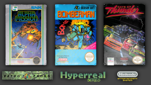
Something slightly different with this one. NES 2.5D "Hyperreal" set. Since NES games didn't come in cases and were just cardboard boxes, I have converted the box images into a cardboard box effect. It took quite a bit of tinkering but I'm happy with the end result. This set is for the NES and not famicom, so it should include most regions other than Japan. Let me know if any boxes are missing and I'll add them in. Any suggestions regarding the boxes themselves then also let me know. Around 850 images. I plan to do the Famicom later. Check my other 2.5D sets. Edit 08.01.23: I was going to revise these, but instead I will release a new pack compatible with the 3D model system.- 6 comments
-
- 15
-

-

-
My understanding is that they're both a bit overkill, including many versions of games including betas, non-working, cracks, etc. I'm not sure of the exact differences between the two.
-
 I'm planning to edit this to replace the game name with the game banner/clear logo/text if no banner or clear logo.
 -
Yes, I had previously edited one of the themes (it may have been default plus, or maybe I copied the default plus code across to my version of the default theme) to do something like this. I remember having difficulty in getting the backup items to show (i.e. if there is no banner then show the clear logo, and if there is no clear logo then show the game name). It's something I'd like to revisit. I'll take a look at it again over the next few days. If anyone knows how to achieve this with code, any pointers would be much appreciated.
-
Have you looked at the goodsets?
-
How do people deal with/organise multi packs of games?
Retrofrogg replied to BobbyTwoKills's topic in Collections and Builds
I'm currently working on a CPC 3D box art project for the Amstrad CPC so have some insight into this too. My approach is to import the item as it originally was - a collection - but then I'm a completist. I'll make up the original artwork too.- 3 replies
-
- 1
-
-
- collections
- multigame
- (and 3 more)
-
 Looks clean.
- 10 comments
-
- 1
-
-
- touch screen
- simple
- (and 2 more)


