
Retrofrogg
-
Posts
1,383 -
Joined
-
Last visited
-
Days Won
8
Content Type
Profiles
Forums
Articles
Downloads
Gallery
Blogs
Everything posted by Retrofrogg
-
Certainly, will do!
-
Haven't had any response to this - there is an ongoing issue where some images in the carousel aren't thumbnailed properly. This occurs pretty frequently. If you click on the blurry thumbnail, then it does show the correct image above it. Example below:

-
 Ah, I understand now. Thanks very much for highlighting some missing covers. I've responded below: The reason some were missed is that Launchbox had combined some of the games, but listed the Beta version as the main game (not sure why when I told it to keep them separate)! Anyway, I will upload an update pack soon with the missing items.
 -
Check the name of the download - "USA/North America". I have done a Europe pack also, but it's listed as a separate download. Take a look and you'll find it.
-
Nice. I would recommend lightening the background in your theme to make the boxes "pop" more.
-
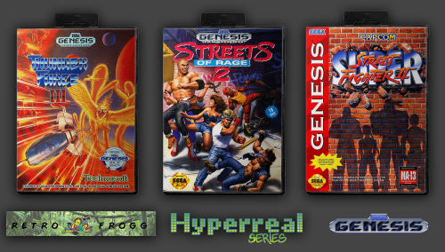
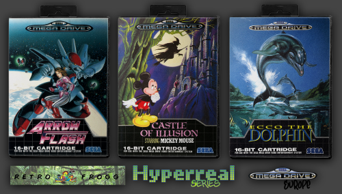
Sega Megadrive (Europe) 2.5D Front Box Art Pack, Hyperreal Series
Retrofrogg replied to Retrofrogg's topic in Game Media
@gamesmame - the Launchbox scraper can grab those -
Sega Genesis (USA/North America) 2.5D Front Box Art Pack, Hyperreal Series View File Sega Megadrive USA/North America region box art. 741 images (No-Intro set) - let me know if any errors or omissions. A few extras are included for non-physical releases. I have my regions currently separated into USA/North America, Japan and Europe; anything not falling into the former 2 regions tends to fall into the Europe region. Why these images? Short of proper 3D model box support in Launchbox, I find that "2.5D" is often the best box image type. 3D boxes can be good and I use them for some platforms, though the angle that they tend to be at makes the cover art a bit less clear, and all the spines can give an overall cluttered appearance which can be distracting from the artwork. The standard scraped box-front images tend to just look like jpg computer images and not the actual physical product. That's where 2.5D comes in. By 2.5D I mean that the image is of the actual front artwork, within the box, facing head on. I'm a perfectionist and want the images to look as realistic as possible - just like the original game boxes. This set is therfore created using a photo-realistic hard plastic case template (not a vector model), complete with the little box hanger and mottled plastic cover, within which the artwork sleeve is inserted. There is some subtle lighting and shadow effect. I went through each item individually so that I could tailor the effect depending on the brightness and contrast of the box art. I'm aiming to create the most realistic sets out there, and am open to any feedback or suggestions. This is over a week's work - in future I will use a Photoshop automation and just set the effect somewhere in the middle, in order to save time! Submitter Retrofrogg Submitted 03/17/2022 Category Game Box Art
-
Version 1.0.0
1,067 downloads
Sega Genesis USA/North America region box art. 741 images (No-Intro set) - let me know if any errors or omissions. A few extras are included for non-physical releases. I have my regions currently separated into USA/North America, Japan and Europe; anything not falling into the former 2 regions tends to fall into the Europe region. Why these images? Short of proper 3D model box support in Launchbox, I find that "2.5D" is often the best box image type. 3D boxes can be good and I use them for some platforms, though the angle that they tend to be at makes the cover art a bit less clear, and all the spines can give an overall cluttered appearance which can be distracting from the artwork. The standard scraped box-front images tend to just look like jpg computer images and not the actual physical product. That's where 2.5D comes in. By 2.5D I mean that the image is of the actual front artwork, within the box, facing head on. I'm a perfectionist and want the images to look as realistic as possible - just like the original game boxes. This set is therfore created using a photo-realistic hard plastic case template (not a vector model), complete with the little box hanger and mottled plastic cover, within which the artwork sleeve is inserted. There is some subtle lighting and shadow effect. I went through each item individually so that I could tailor the effect depending on the brightness and contrast of the box art. I'm aiming to create the most realistic sets out there, and am open to any feedback or suggestions. This is over a week's work - in future I will use a Photoshop automation and just set the effect somewhere in the middle, in order to save time!- 14 comments
-
- 18
-

-

-

-
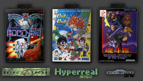
Sega Megadrive (Japan) 2.5D Front Box Art Pack, Hyperreal Series View File Sega Megadrive Japan region box art. 476 images (No-Intro set) - let me know if any errors or omissions. A few extras are included for non-physical releasese (e.g. SegaNet). I have my regions currently separated into USA/North America, Japan and Europe; anything not falling into the former 2 regions tends to fall into the Europe region. Why these images? Short of proper 3D model box support in Launchbox, I find that "2.5D" is often the best box image type. 3D boxes can be good and I use them for some platforms, though the angle that they tend to be at makes the cover art a bit less clear, and all the spines can give an overall cluttered appearance which can be distracting from the artwork. The standard scraped box-front images tend to just look like jpg computer images and not the actual physical product. That's where 2.5D comes in. By 2.5D I mean that the image is of the actual front artwork, within the box, facing head on. I'm a perfectionist and want the images to look as realistic as possible - just like the original game boxes. This set is therfore created using a photo-realistic hard plastic case template (not a vector model), complete with the little box hanger and mottled plastic cover, within which the artwork sleeve is inserted. There is some subtle lighting and shadow effect. I went through each item individually so that I could tailor the effect depending on the brightness and contrast of the box art. I'm aiming to create the most realistic sets out there, and am open to any feedback or suggestions. This is over a week's work - in future I will use a Photoshop automation and just set the effect somewhere in the middle, in order to save time! Submitter Retrofrogg Submitted 03/16/2022 Category Game Box Art
-
Version 1.0.0
420 downloads
Sega Megadrive Japan region box art. 476 images (No-Intro set) - let me know if any errors or omissions. A few extras are included for non-physical releasese (e.g. SegaNet). I have my regions currently separated into USA/North America, Japan and Europe; anything not falling into the former 2 regions tends to fall into the Europe region. Why these images? Short of proper 3D model box support in Launchbox, I find that "2.5D" is often the best box image type. 3D boxes can be good and I use them for some platforms, though the angle that they tend to be at makes the cover art a bit less clear, and all the spines can give an overall cluttered appearance which can be distracting from the artwork. The standard scraped box-front images tend to just look like jpg computer images and not the actual physical product. That's where 2.5D comes in. By 2.5D I mean that the image is of the actual front artwork, within the box, facing head on. I'm a perfectionist and want the images to look as realistic as possible - just like the original game boxes. This set is therfore created using a photo-realistic hard plastic case template (not a vector model), complete with the little box hanger and mottled plastic cover, within which the artwork sleeve is inserted. There is some subtle lighting and shadow effect. I went through each item individually so that I could tailor the effect depending on the brightness and contrast of the box art. I'm aiming to create the most realistic sets out there, and am open to any feedback or suggestions. This is over a week's work - in future I will use a Photoshop automation and just set the effect somewhere in the middle, in order to save time! -
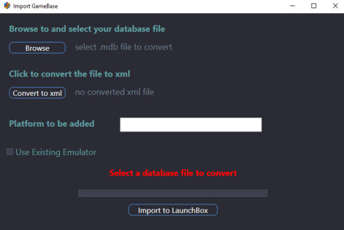
GameBase database Importer
Retrofrogg commented on JoeViking245's file in Third-party Apps and Plugins
 Awesome - in the absence of official Lunchbox support, a much needed plugin! I look forward to trying it out again soon when I move on to the next set.
 -
Sega Megadrive (Europe) 2.5D Front Box Art Pack, Hyperreal Series
Retrofrogg replied to Retrofrogg's topic in Game Media
Thanks a lot. Genesis version will be next. Then Megadrive (Japan). -
Sega Megadrive (Europe) 2.5D Front Box Art Pack, Hyperreal Series View File Sega Megadrive Europe region box art. 552 images (No-Intro set) - let me know if any errors or omissions. I have my regions currently separated into USA/North America, Japan and Europe; anything not falling into the former 2 regions tends to fall into the Europe region. Why these images? Short of proper 3D model box support in Launchbox, I find that "2.5D" is often the best box image type. 3D boxes can be good and I use them for some platforms, though the angle that they tend to be at makes the cover art a bit less clear, and all the spines can give an overall cluttered appearance which can be distracting from the artwork. The standard scraped box-front images tend to just look like jpg computer images and not the actual physical product. That's where 2.5D comes in. By 2.5D I mean that the image is of the actual front artwork, within the box, facing head on. I'm a perfectionist and want the images to look as realistic as possible - just like the original game boxes. This set is therfore created using a photo-realistic hard plastic case template (not a vector model), complete with the little box hanger and mottled plastic cover, within which the artwork sleeve is inserted. There is some subtle lighting and shadow effect. I went through each item individually so that I could tailor the effect depending on the brightness and contrast of the box art. I'm aiming to create the most realistic sets out there. This is over a week's work - in future I will use a Photoshop automation and just set the effect somewhere in the middle, in order to save time! Submitter Retrofrogg Submitted 03/14/2022 Category Game Box Art
-
Version 1.0.0
773 downloads
Sega Megadrive Europe region box art. 552 images (No-Intro set) - let me know if any errors or omissions. I have my regions currently separated into USA/North America, Japan and Europe; anything not falling into the former 2 regions tends to fall into the Europe region. Why these images? Short of proper 3D model box support in Launchbox, I find that "2.5D" is often the best box image type. 3D boxes can be good and I use them for some platforms, though the angle that they tend to be at makes the cover art a bit less clear, and all the spines can give an overall cluttered appearance which can be distracting from the artwork. The standard scraped box-front images tend to just look like jpg computer images and not the actual physical product. That's where 2.5D comes in. By 2.5D I mean that the image is of the actual front artwork, within the box, facing head on. I'm a perfectionist and want the images to look as realistic as possible - just like the original game boxes. This set is therfore created using a photo-realistic hard plastic case template (not a vector model), complete with the little box hanger and mottled plastic cover, within which the artwork sleeve is inserted. There is some subtle lighting and shadow effect. I went through each item individually so that I could tailor the effect depending on the brightness and contrast of the box art. I'm aiming to create the most realistic sets out there, and am open to any feedback or suggestions. This is over a week's work - in future I will use a Photoshop automation and just set the effect somewhere in the middle, in order to save time! -
The issue with some image thumbnails not generating properly in the carousel persists:
-
 Sorry for the spamming lol. Is there a way to get the theme to show the "background" image in the marquee area, but if there isn't one then show the clear logo? The default seems to be to show one on top of the other.
 -
Another thing - the platform icons are a bit close to the "expand" arrow: Adding some space after the arrow, and reducing the space that comes after the icon would look better IMHO. It would also be nicer I think if the icons could be square rather than rectangular. The QuickPlay frontend does this pretty well:
-
The "black bars at the sides of videos" issue seem to have come back with this theme? I tried chaging PreviewBackground from "Black" to "Transparent" but that doesn't seem to do the trick! Edit: changing the following fixed it: ForceVideoPreview16X9="False" Is there a way to reduce the fade in time of the Banner and the rest of the game details?
-
Can we get the banner area to show the marquee for arcade? Edit: I figured out how to edit the xaml to do this. I disabled the clear logo appearing there, and set the marquee as the top priority in Launchbox for game background view. I then changed the stretch type to "fill". Now the marquees appear nicely at the top!
-
Icon support in the side bar!! I've been waiting on this for forever. Will this feature be added to the default theme as an option? Are icons supported for platform categories and playlists too? And the banner at the top looks excellent - in particular for arcade games. Great work.
-
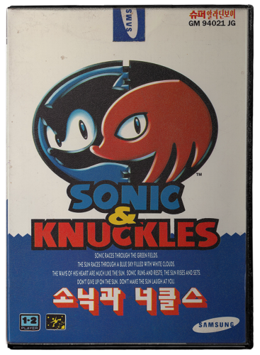
Super Aladdin Boy (Genesis Korea region) 2.5D Box Art Set View File 2.5D box art set for the Super Aladdin Boy - what the Sega Genesis was called in Korea. 76 images, based on the No-Intro set. Some covers were hard to come by. Let me know if anything is missing. This is niche set that I'm releasing before doing the proper Genesis and Megadrive sets. Includes original cover art inserted into correct box with mottled pastic cover. Submitter Retrofrogg Submitted 02/25/2022 Category Game Box Art
-
Version 1.0.0
76 downloads
2.5D box art set for the Super Aladdin Boy - what the Sega Genesis was called in Korea. 76 images, based on the No-Intro set. Some covers were hard to come by. Let me know if anything is missing. This is niche set that I'm releasing before doing the proper Genesis and Megadrive sets. Includes original cover art inserted into correct box with mottled pastic cover. -
Oh, so there is a horizontal one? That is what I was asking.
-
I'm not sure if I've been understood. Horizontal games are not in the vertical playlist - that makes sense of course! I'm presuming that the vertical playlist is a list of all the MAME games that used a vertical monitor orientation. I would also like a similar list but for horizontal games. Why would you have one without the other?