

Retrofrogg
-
Posts
1,290 -
Joined
-
Last visited
-
Days Won
7
Content Type
Profiles
Forums
Articles
Downloads
Gallery
Blogs
File Comments posted by Retrofrogg
-
-
Great looking set! Are the dimensions of the inlay correct or are they stretched? Any plans to add the missing covers from the no-intro set?
-
Looks good. Doesn't the game name on the spine need to be angled along with the spine itself?
-
Great, thanks @faeran Really appreciate the input. Will send you a PM.
-
Trying this out now @faeran. First impressions:
Platform tree and game images view are nice and clean, due to the dark grey background. There seems to be a tiny amount of change to the background when a game is selected; does an image load in the background but just very dark or with maximum transparency? I think it would be nice to have this effect a bit more visible. In the game images view, is the box art faded a little? When you hover the mouse cursor over a game it brightens. I'm not keen on having the artwork faded - would rather show it properly.
I like the way that the selected platform is clearly highlighted in the platform tree. Would it be posslbe to also highlight any parent platforms/categories for the selected platform? This way the user can quickly see which platform category, platform and playlists is being selected.
In terms of the game details pane, I love the tabs. Much better than scrolling through one big list. It would be great to have 3 tabs however - for game description, info and images. Currently the game description and game info are grouped together in the same tab, necessitating the game info to be in a much smaller font and in a different colour text - and still necessitating scrolling in some cases. A separate tab would allow the game info to be displayed properly in all its glory. I note that for MAME, the MAME high scores is in a separate tab, which is nice.
I'm not a big fan of the top half of the front box image being displayed in a slightly faded fashion at the top of the game details pane - especially when the game video plays over the top of it. It's a bit distracting, cluttered looking and also likely a duplication of media as most users would probably be browsing by front box art anyway (though 3D boxes probably come a close second). Faded fanart or screenshot might serve better here. The video itself could probably be made a bit bigger.
Do you think it would be relatively easy for me (a coding n00b), given that you have commented most items within the XAML files, to make the above adjustments?
Edit: perhaps not so easy lol. My rudimentary attempt at creating an extra tab failed. I just copied the below in the hope that it would add an extra tab:
<TabItem Header="Info 2"><ScrollViewer VerticalScrollBarVisibility="{Binding ScrollBarVisibility}"><StackPanel Orientation="Vertical" HorizontalAlignment="Center"></TabItem>But on starting Launchbox I get the error " An error occurred while parsing the custom GameDetailsView. The default view is shows instead. Details on the error are below: System.Windows.Markup.XamlParseException: The 'Stackpanel' start tag on line 223 position 34 does not match the end tag of 'Tabitem'. Line 230, position 21."
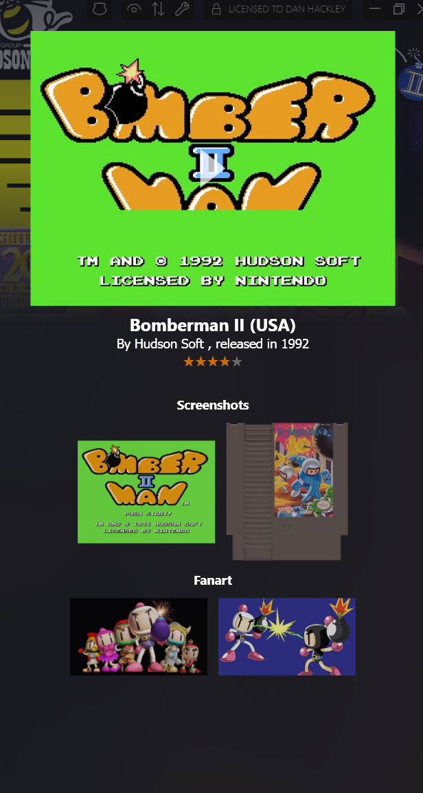
Something else - in the image tab, thumbnails are shown, which is great. However, some are incorrectly labelled (despite being correctly labelled in Launchbox, according to the game edit window) and some images are missing altogether. See the Bomberman II image tab for NES below:

The thumbnails only show 4 images though there are actually 10. It shows the game cartridge under screenshots. Also, it doesn't show any of the box artwork (front, back, 3D), advertisement flyer or anything else. It would be great to have the images grouped here under box art (including cart/disk/etc), screenshots, other (including advertisement flyer, clear logo) and fanart.
-
 3
3
-
-
That would be awesome @C-Beats. Would open up a world of possibilities theme-wise, enable a more immersive experience and really make use of the available screen real estate!
-
Will definitely check this out. @faeran, based on your knowledge, would it be possible to make a dual-screen theme? For example, to have the system tree and games list on one screen, with the game details pane (including info, video, snapshots etc) on the other? This is something I would really like to do if possible.
-
.png.c4098a6592fac85a760975294f596ae5.png)
Looking good! I'm doing similar work on the Amstrad CPC, so know how time consuming this can be.
-
 2
2
-
-
![More information about "RetroMags - [Theme Workshop]"](https://forums.launchbox-app.com/uploads/monthly_2021_09/Title.jpg.3a051384210ad6f7507647d9126e801c.jpg)
Cool looking theme!
-
1
-
-

This is looking great. Any progress with a Launchbox theme creator? 😁
-
Cool idea, I like it. Seems to be a bit jerky at times though - is that just your machine?
-
Looks great - but the file is nowhere near 6GB as it says in the description?
-
17 hours ago, spycat said:
These were well worth the wait. Excellent work indeed.
Many thanks spycat. More packs to follow! It's time-consuming work as each one is done separately by hand to ensure everything matches up.
-
Nicely done. May I suggest adding a "sheen" effect to the covers to make the boxes look more realistic? The edges of the case look fairly good but the cover art looks kind of stuck on.
-
1
-
-
It works perfectly, thanks! Really useful tool.
-
 1
1
-
-
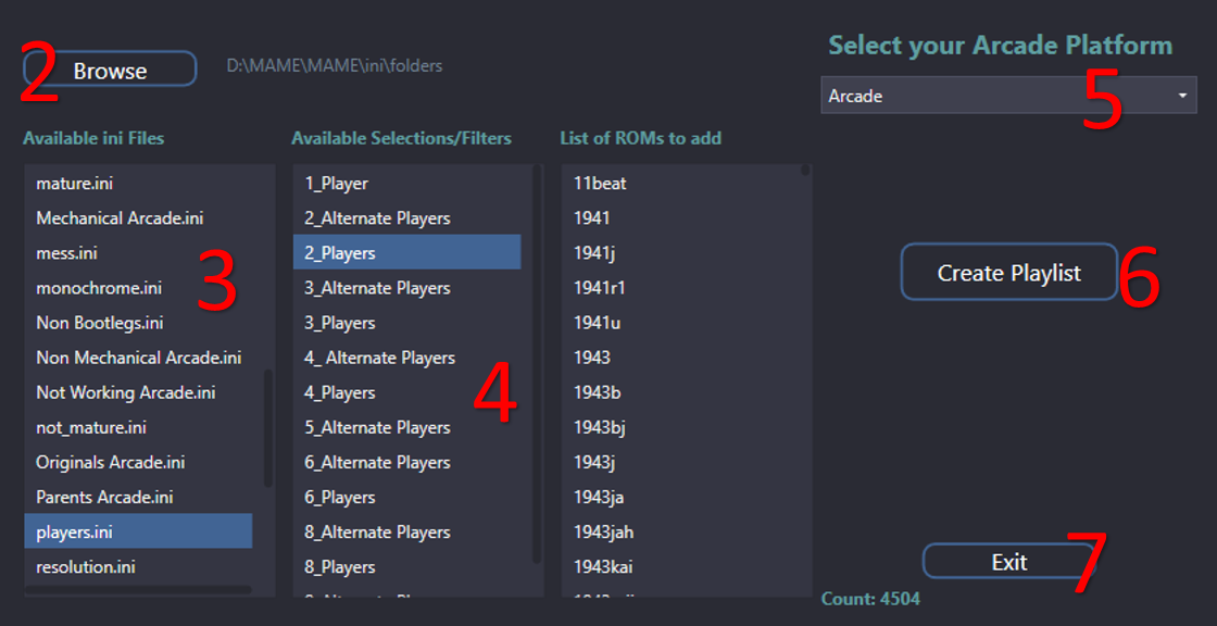
Thanks @JoeViking245 - I tried to import the vertical.ini you listed above into your tool - it lists 2906 roms but when I click "create playlist" I get an error - "unhandled exception has occurred in a component in your application".
-
This is great! But I can't find a way to generate a list of vertical games?
-
Nice. But why are they so small?
-
Nice, don't think I've seen this set before. Which romset and region, and how many games?
-
Cart itself looks hi res but the artwork on the art low res?
-
Great work as ever Beezy!
-
1
-
-
Thanks a lot, these look great! Only thing I might change is the colours round the edges - weren't the original boxes black?
-
1
-
-
Excellent set @ABeezy13 ? Love the 2.5D. I really like the 3D boxes but when going through a collection of them it can look a bit cluttered; 2.5D is cleaner and a nice compromise.
I'm currently trying to clean up some of my media too. Ran the LB media cleaning feature yesterday and it moved a whole bunch of files; hopefully the right ones!
-
1
-
-
Very specific.
-
![More information about "Retro Bedroom - [Theme Stream]"](https://forums.launchbox-app.com/uploads/monthly_2020_07/1438802701_Platform1-Title.PNG.f40adde9f6964bbd1fe80d5758bb1ed6.PNG)
Looks good! Would be nice if it showed the actual console rather than the NES each time.
.png.9ee475ebb70c597770d998a8a972bdbe.png)
.png.9d857447f67de2106ff6d10e75c1dfbc.png)
.png.d43896ff3c1caabeb79d7d129675bb58.png)
(SGBEnhanced).png.2cc963fe8b41c388cb88ba07852b116c.png)
.png.dda1d857c5305fa550ac55e18d347124.png)
.png.3d1ed9c9cd1e7effc75db8e8143d1132.png)
.png.1134419140668529c7ab7116f4c02819.png)
COLORFUL platform video set
in Platform Theme Videos
Posted
Any chance of doing Super Aladdin Boy?