
soqueroeu
-
Posts
198 -
Joined
-
Last visited
Content Type
Profiles
Forums
Articles
Downloads
Gallery
Blogs
Everything posted by soqueroeu
-
Hey ! Why can't I point to an images folder to import them into Launchbox? How about implementing this in a future version? Also, Why does Launchbox place some images separate, instead a specific subfolder?

-
What criteria does Launchbox use to determine if a file is no longer in use during a media cleanup? There are a few scenarios we can consider: The file has never been used File has never been used by the current theme File not in use due to user-config priority File has a copy currently in use The respective game for that file has been deleted There may be other criteria as well. What do I need to know to be sure I can delete a file? Thanks!
-
Thanks for your time. Well, I checked the feature and everything is disabled for any image. No downloads allowed. As I said, I imported the first platform during the Launchbox installation process, not after. I actually chose not to download any images, but it seems that had no effect the first time. Anyway, I did a new import for another platform and this time, without any image downloads. Could we be dealing with a bug? Also, can I trust Launchbox to always pick the best version of each cover image, in terms of originality? What criteria does the Launchbox team use to make this selection?
-
I started a new Launchbox installation, with the new version 13.27. One of the goals is to remove duplicate images. As an initial test, I imported only the NES platform and, if I'm not mistaken, I denied any image downloads, but at the end of the process, I have several folders full of them. There are images in Clear Logo, Fanart, Front, Screenshot, and Screenshot - Game Title. The last one contains only 3 images. So what should be the expected behavior for this new build regarding images? Also, is it possible to make Launchbox scrape images by pointing to a folder I have, using the filename as a parameter? Thanks!
-
 Hi All!! I intend to obtain a playlist for each system where the playable character is either a ninja or a samurai. I want to try this feature on other types as well. How could I get a playlist of games with only ninja or samurai characters, on all systems from 8-bit onwards? Is there a plugin that does this filtering, not necessarily in Launchbox? Thanks!
 -
This theme is clean and responsive. I've been using it as my favorite. @bundangdon could you tell me how I can change the font below the game's clean logo? If possible, I wanted to leave the same font as the game details, or a softer one. Thanks!
-
Thanks so much! Thansk so much! Thank you all so much for the clarification... Sometimes I got lost with these folders. I'll try some things! I think it would be very helpful if these tips appeared in a text box in the configuration window itself. These tips could also indicate which settings will be affected in BigBox mode. @Jason Carr (tradução)
-
What should I put in each of these folders and how does Launchbox use them? In \LaunchBox\Videos\''any system''\ , we have three folders In the details tab, platform editor we have a video path: Also, in the folders tab, platform editor, one more video path:
-
Good! Thanks for your answer.
-
Helo! Which folders are used only by Launchbox? Which are used only by BigBox? Which folders/files affect both modes? In other words, how do you know where an image or video file will appear in the theme? Will it affect Launchbox, BigBox, or both?
-
Hmmm. Im gonna try this. Thanks!
-
Hello everyone! I`m using LaunchBox v13.23. I'm trying to add some platforms based on others, but sometimes they don't fit into their appropriate category. If I try to move them to their respective category, they don't move, but instead duplicate. Is this a bug? Is there a way to avoid this?
-
community COLORFUL resources
soqueroeu replied to viking's topic in Third-Party Applications and Plugins (Released)
Very nice Contribuitions! -
.thumb.png.ad8b55cb18754ed661c040f227f744d9.png) Fantastic job. Keep going on! Thanks!
Fantastic job. Keep going on! Thanks! -
Tanks Guys! Normally I change some images I don't use the default LB directories Do you have any tips on which folders I should keep backed up?
-
Sorry, I should have said: the message I received is when I try to update a BigBox theme.
-
Guys, it's been a while since I've touched Launchbox. Every time I had to update BigBox, I received a warning to be careful about data loss. Does this still happen? What is the best way to update BigBox themes without losing data or settings?
-
Guys, I have two questions about this topic: Can this theme automatically create banners with arts and game images? Do you have a link with a larger package that includes the largest number of banners possible?
-
reflection lights SOQUEROEU TV Backgrounds
soqueroeu commented on soqueroeu's file in Platform Bezels/Overlays
(RevA)-220213-185550.thumb.png.50964ba215b076b2e04652751070ac9e.png) These backgrounds are designed to be controlled by shader parameters only. The Mega Bezel will attempt to match the internal resolution to the best aspect ratio values. It is possible to enlarge the entire screen, without significant loss of game content. However, the surrounding graphics (TV and background) may lose some definition when they enter values different from the native resolution of your monitor/TV. Look for this paremeter:
These backgrounds are designed to be controlled by shader parameters only. The Mega Bezel will attempt to match the internal resolution to the best aspect ratio values. It is possible to enlarge the entire screen, without significant loss of game content. However, the surrounding graphics (TV and background) may lose some definition when they enter values different from the native resolution of your monitor/TV. Look for this paremeter: -
Hey @viking , Please, would you have a version of the Super Nintendo US version? Thanks!
- 1 reply
-
- 1
-

-
I'm in favor of having a screenshot-only version, as long as gameplay videos are present. I like the videos a lot. But they end up slowing things down... Also, not all of us want to keep tons of video files stored. Colorful is a very beautiful theme and with images it is already amazing. Keep Going, my friend!
-
Hi @viking and @faeran ! Guys, this is what I have now: Not sure if this is the intentional design, but honestly, I think this view could be better. It wouldn't be all bad, if the other items had a reduced size, so the selected one gained more prominence and didn't have to be cut around the edges. Any predictions to improve this? What happened to the good ideas we discussed in the past? Here, two design suggestions. What do you think?
-
reflection lights SOQUEROEU TV Backgrounds
soqueroeu commented on soqueroeu's file in Platform Bezels/Overlays
Yes, in the newest versions of Mega Bezel, it's possible! For those who want to increase the viewing area in my presets+backgrounds, it is possible with just one adjustment, in this parameter: . . Additionally, you may want to adjust the height, as I did in the image below. See now the edges of the TV reach the end above and below: -
Nintendo Famicom (2D Carts) [ArcDragon]
soqueroeu commented on Arcanthur's file in Nintendo Entertainment System
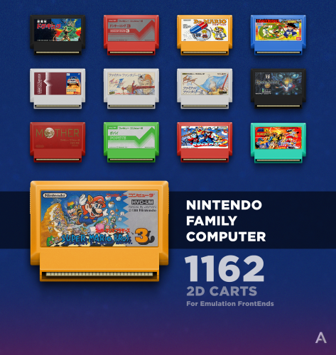 Hey @Arcanthur , They are beautiful. Congratulations! But there's something wrong with the perspective, don't you think? We shouldn't be looking at the PCB from that angle. 🤨
 -
 Hi @klyze_pt Some games (like MK) have unusual rate aspects. Unfortunately I don't have the clean files. But yes, an alternative pack, without the bezel. They still have the frame cut. Maybe it helps. I have updated the package now, please download it again. Maybe you have to adjust the parameters to increase the frame width and thus reach the sides. Alternatively, you can also modify the shader parameter to display the tube behind the clipped area of the overlay. I hope I can help you 😃


.thumb.png.ad8b55cb18754ed661c040f227f744d9.png)
(RevA)-220213-185550.thumb.png.50964ba215b076b2e04652751070ac9e.png)


