
THK
-
Posts
63 -
Joined
-
Last visited
Content Type
Profiles
Forums
Articles
Downloads
Gallery
Blogs
Everything posted by THK
-

GCE Vectrex Bezels Pack for RocketLauncher
THK commented on ci2own's file in Platform Bezels/Overlays
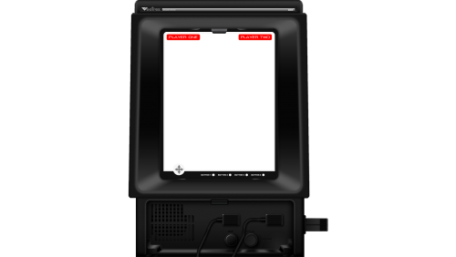 "the rest of the overlays and the main GCE Vectrex Device are from the "mrdo.mameworld.info" site" Those were created by me & Gigapig back in the day over at HyperSpin. No idea how they ended up over there. Not that I care too much.
 -
Huge Mame Marquee Collection including many in 4K resolution
THK commented on Mr. RetroLust's file in Arcade
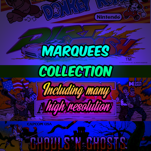 No thank you for continuing the work! though it might be another few years before I finally build an arcade system again and make use of yours
 -
 Dunno if this is the same set as I've once found in Reddit. But I'll be having some fun comparing my very non-professional redrawn logos set to this, once downloaded
- 87 comments
-
- 1
-

-
- platform clear logo
- platform logo
- (and 6 more)
-
Huge Mame Marquee Collection including many in 4K resolution
THK commented on Mr. RetroLust's file in Arcade
Ah yes, I remember cleaning/restoring and redrawing a bunch of these. Brings me back I had such a big to do list with various quality source material left, before I buggered out of the scene. At least I managed to finished my collection of system logo redraws (and a shit ton of arcade manufacturers/publishers)! 😄 -
I believe I once traced it in vector for a HyperSpin theme. But it's on a hdd in a box (recently moved)
-
wrong forum section maybe?
-
too bad the official Rockman website didn't have the chars separated
-
Why? it's a very easy vector redraw, I bet you could redraw it in a few minutes.
-
but OCD!
-
I've done a NESiCAxLive, should be in the arcade system logo set Taito Nesica.zip
-
true
-
Just request: make THK's logo set into Neon logos
-
I get that I know my way around PS, just that if the variations weren't that great, it might've been a decent starting point for anyone trying to make a similar logo.
-
You could save the layer style(s) for others to use of course. Even though they might vary from logo to logo.
-
Just get your hands on Photoshop through normal or 'alternative' channels if you want anything done efficiently and have the people able to help you
-
GIMP... I feel for you unfortunately I can't help outside of PS
-
commons.wikimedia
-
Maybe something more like this, but the letters better stylized

-
the logo's text style is crap I could do something better in a jiffy, just not any specific idea on what style would fit. But basically anything other than this would be better. I'm from HS, one of those OCD quality control bastards
-
This is a verrrry poor logo done by me a long time ago. Did it for a requested theme, dunno if I ever even released it as I thought my 1st attempt at the logo was utter crap. Always hard, looking back at your early work when your skill set was so much smaller.
-
what @Riffman81 said
-
I like it
-
Better yes, but it has some weird little flaws. Maybe PM me your source and wip .psd zipped up and I'll have a look at it.
-
Haha, no need for permission. Thought I'd made that clear in the thread But you really want to use the pen and shape tool as much as possible redrawing stuff. Makes it crisp and gives better strokes that don't pixelate so much (shape properties, not layer style strokes). If you're having a hard time with those I'm willing to help out.


