

shadowblind
-
Posts
148 -
Joined
-
Last visited
Content Type
Profiles
Forums
Articles
Downloads
Gallery
Blogs
Everything posted by shadowblind
-
Oh my. This is fantastic. First new theme in a long time that I've REALLY just loved. It's different, well-designed, and looks great in 4k, give-or-take some text upscaling (but that seems to be a mostly windows issues). Incredible work, viking. Any chance for Consoles, Handhelds, Computers videos in the same vein as the specific consoles? That's the only thing holding me back from using it as my primary.
-
Excellent theme. Never got around to it before due to small text sizes on 4k, but after changing them in the xml, the theme is utterly fantastic. Brilliant idea, too.
-
Can't figure this out at all. Neither themes with videos or without, can't get any music to play at any level in Bigbox. Would also like the answer to this.
-
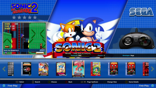 Fantastic Theme. Took me a while to get around to it, but this theme's box-art and fanart focused layout sole me with one big, big plus: controllers overlaid with Xbox One buttons. I have a lot of folks who rarely play games over and the layouts under each platform are a lifesaver. That said, are there any schemes for handhelds? Or a simple six-button joystick picture for arcade (with no Xbox button overlays)? Those are pretty much my only gripes so far--my biggest issue is with launchbox's lack of fanart for more obscure games. Not an issue with the theme.
 -

RetroHumanoid Genre Video Set
shadowblind commented on RetroHumanoid's file in Playlist Theme Videos
 Nice themes, was wondering, could we also get a theme for party games? I often have mixed-aged groups over, and an all-ages friendly party games theme would be super helpful.
 -
Been wondering, are there any unified themes for Computers, Consoles, Arcade, Handhelds, and Playlists? Not sure if I'm looking in the right place
-
I actually really enjoy the gamepad view. Because I often have different groups of folks playing games, knowing the controls is important before a game boots. Thanks for the great work on this.
-
Getting a fatal error that crashes launchbox (Inner Exception) Length cannot be less than zero. Parameter name: length App: Big Box Version: 7.16 Type: System.ArgumentOutOfRangeException Site: System.String Substring(Int32, Int32) Source: mscorlib at System.String.Substring(Int32 startIndex, Int32 length) at HelperControl.GetTotalGamesConverter.Convert(Object value, Type targetType, Object parameter, CultureInfo culture) at System.Windows.Data.BindingExpression.TransferValue(Object newValue, Boolean isASubPropertyChange) at MS.Internal.Data.ClrBindingWorker.NewValueAvailable(Boolean dependencySourcesChanged, Boolean initialValue, Boolean isASubPropertyChange) at MS.Internal.Data.PropertyPathWorker.UpdateSourceValueState(Int32 k, ICollectionView collectionView, Object newValue, Boolean isASubPropertyChange) at MS.Internal.Data.ClrBindingWorker.OnSourcePropertyChanged(Object o, String propName) at System.Windows.WeakEventManager.ListenerList`1.DeliverEvent(Object sender, EventArgs e, Type managerType) at System.ComponentModel.PropertyChangedEventManager.OnPropertyChanged(Object sender, PropertyChangedEventArgs args) at Caliburn.Micro.PropertyChangedBase.OnPropertyChanged(PropertyChangedEventArgs e) at Caliburn.Micro.XamlPlatformProvider.<>c__DisplayClass8_1.<OnUIThread>b__0() (Outer Exception) An error occurred while dispatching a call to the UI Thread App: Big Box Version: 7.16 Type: System.Reflection.TargetInvocationException Site: Void OnUIThread(System.Action) Source: Caliburn.Micro.Platform at Caliburn.Micro.XamlPlatformProvider.OnUIThread(Action action) at Caliburn.Micro.PropertyChangedBase.NotifyOfPropertyChange(String propertyName) at Unbroken.LaunchBox.Wpf.BigBox.ViewModels.FiltersViewModelBase.set_DetailsViewModel(FilterDetailsViewModel value) at (PlatformFiltersViewModelBase , Object ) at Unbroken.LaunchBox.Wpf.BigBox.ViewModels.PlatformFiltersViewModelBase.<SelectionChangedTimerElapsed>b__11_0(Object state) at System.Threading.ExecutionContext.RunInternal(ExecutionContext executionContext, ContextCallback callback, Object state, Boolean preserveSyncCtx) at System.Threading.ExecutionContext.Run(ExecutionContext executionContext, ContextCallback callback, Object state, Boolean preserveSyncCtx) at System.Threading.QueueUserWorkItemCallback.System.Threading.IThreadPoolWorkItem.ExecuteWorkItem() at System.Threading.ThreadPoolWorkQueue.Dispatch() Recent Log: 12:34:03 PM Music.Resume Start 12:34:05 PM Music.Pause Start 12:34:05 PM Music.Resume Start 12:34:06 PM Exception
-
Not at all, just on the view that places the video top-center. I'm currently using the background-video view which is my favorite. That view works fine.
-
Sure! I'm running on a 4k display, btw, so results may vary. I'm just gonna say what I changed for this theme, lemme know if you need more info. First off I used these clear logos for the theme: I also enabled all the plugins in the plugins folder by Right Click > Properties > At the bottom I allowed it to run. Settings: Background Fade: 60% Images: all boxes checked except 5 and 6. Videos: All boxes checked except Use Platform background Videos That's it, really. Didn't change much. The most likely issue for it looking wonky is probably the plugins not running Yeah, tried both. The videos are still squished
-
Wonderful theme. On 4k, though, the view where videos are displayed top-center makes them 4:3, I believe, instead of a widescreen resolution. Minor quibble since I use the background video view, but just thought I'd point it out
-
theme Aeon MQ7 [Preview Version]
shadowblind replied to CriticalCid's topic in Big Box Custom Themes
Great theme! Quick question, where did you get those Platform Clear Logos from? They look great in the preview pics. Also, the theme looks great in 4k -
So I've figured a few more things out. Any game listed in the DEmul compatibility file runs well if it's the MAME version. Any .dat version, however, needs to be manually loaded through the "Load Decrypted" button. Now I'm hoping to find a way that we can load .dat files into Launchbox without having to go through the games menu and Load button in Demul. There are a lot of good games that have .dat versions.
-
Yep, mine looks the exact same, down to the T I just tried a different ROM, Chaos Field, and it worked where Azumanga Bubble and Ikaruga didn't while launching from Launchbox. Both ROMS work when booted from Demul directly, however. I did this test with Chaos Field because when I tried to launch Azumanga, a list pops up in Demul with a number of games. Azumanga wasn't one of them, while Chaos Field was. I believe(?) that may have something to do with it . . . So a new question, how do I add new games to DEMUL's Naomi games list? Like, how do I add Azumanga for example, so I don't have to load it through the Decrypted button? Thanks again for the help so far, neil!
-
Sorry, that was actually a typo in the post on my part, haha. It is lowercase in the emulator. Just wondering, but I'm using this emulator with the .bat files . . . is that the problem? Should I use the mame version instead? EDIT: Here's the direct copy-paste: Sega Naomi -run=naomi -rom= True
-
Sorry for the bump, but I can't figure out where I'm going wrong here trying to run Naomi on demul. I have "No space before Rom" checked, "Use File name only" checked, with this command line on the Associated Platform's list for Sega Naomi: -run=Naomi -rom= But when i try to launch a game, it brings up the game list instead. I followed this entire thread and the video tutorial twice. At the end of my rope trying to figure it out. Any help is appreciated
-
That art is wonderful. Beautiful theme!
-
Console Playlist/Genre Intro Videos - Animated
shadowblind replied to Robin55's topic in Playlists & Playlist Media
Awww yeah I see Zero tolerance in there. Game was so awesome back in the day. -
I'm getting the same issue as ALIE arcade shows game total but no other Platform Category else does
-
Stellar ~ RetroArch Nightly Updater
shadowblind replied to wyzrd's topic in Third-Party Applications and Plugins (Released)
Error when trying to update. "Buildbot may be offline." -
Thanks, really nice theme.One question, can the "Total Games" be removed from the Platform Categories view? Mine always displays zero no matter what, so it just looks really bad. Thanks!
-
[EmuMovies] Game Boy Advance Video Snaps Released (v2.0)
shadowblind replied to circo's topic in Game Media
I'll add Forbidden Siren, Max Payne, Silent Hill 4, Ultimate Spider-Man, Urban Chaos (not sure if this one works), Valkyrie Profile 2, andXenosaga Episode III to the list that have "Not Working" videos too. Thanks again -
You should call it Simple and Clean
-
[EmuMovies] Game Boy Advance Video Snaps Released (v2.0)
shadowblind replied to circo's topic in Game Media
Sure! Silent Hill 2, 3, mercenaries, Project Snowblind for just a couple. i'll try to get back with more. -
[EmuMovies] Game Boy Advance Video Snaps Released (v2.0)
shadowblind replied to circo's topic in Game Media
Awesome, thanks for the update. Would like to request new PS2 snaps next . . . some like Silent Hill 2 and 3 still say "Game Not Playable" though they are now, haha.


