Leaderboard


Popular Content
Showing content with the highest reputation since 08/10/2016 in File Reviews
-
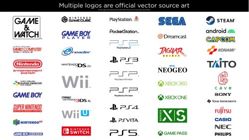 I don't think I've ever left a review...but this is warranted 100%! Wow... just wow. You've done the unthinkable! This is an incredible thing. As someone who also has fallen down rabbit holes spending countless hours on artwork I appreciate your commitment and top notch work! All of these logos will look fantastic across many applications for many people! Thanks for doing this!!!!!!!! ***** FIVE BIG FAT GOLDEN STARS FOR YOU DP!7 points
 -
 Looking to create a theme for BigBox? This is what you should be using, whether you know XAML or not. This is just an amazing program.7 points
 -
 Great Theme, nice video backgrounds. I've used this theme ever since I purchased Launchbox. I can see a lot of work has gone into this theme and I salute you sir. Looks Great on my 49'' 4K TV.7 points
 -
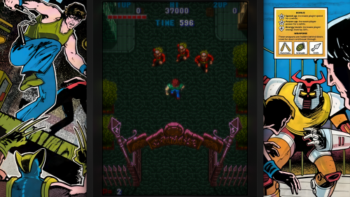
 You can tell this was made with an extreme amount of attention to detail by someone who actually played a lot these consoles and did their research. The amount of effort and creativity in this is such that you may discover something new each time you look through library. I feel like this is the height of retro aesthetic for emulation as it gets, this is the prettiest UI to me and it stands above the rest in so many ways while still being functional rather than having to choose between functionality or retro aesthetic. This is far above the rest in many ways, it does not info dump you with retro stock images, but it rather illustrate a retro environment in a minimalistic but aesthetically pleasing way. You can see the cartridge before it goes into the GameBoy Color from behind, a feeling that is etched in my memory, you can see the GameCube cartridge, the small GameCube disc spinning, surrounded by an environment reminding you of the purple GameCube, one of the most if not the most iconic one in the west when we didn't get the orange or other colors like in Japan. The small lights, the custom accurate button placement that are also serve a function, the details such as cartridges, CDs and images are not to the left, to the right or in a corner, nor is relative information such as player numbers, it is all placed in a very digestible and to the point way, unlike some other UIs in which you search for text on one side, see the art on another, and may see an animation with stock images for a background like some info dump cluster of "retro things" trying to be retro, rather than being the retro environment that is this UI. The environment that is themed after the console you select is also non invasive, functional and absolutely beautiful, all music included in the UI is also chill and extremely nostalgic, the Sega Dreamcast one alone had vibes that awakened core memories from my childhood. Basically I can tell this was made with alot of love and effort, looking forward to seeing more of this.6 points
 -
 My all time favorite theme just got a huge update/overhaul, what a day! This theme has it all: It's gorgeous; It's well optimized; It has a lot of parts that you can customize; It has an absurd amount of beautiful custom art made by @Scratcher. Stop reading this and go get it! I guarantee you won't regret! Huge thanks for @faeran and everybody that contributed to this!6 points
 -
 ? Bravo!! ?6 points
 -
2DBox.thumb.png.faa823f30194b63ce76f522a7ec16c1d.png) 0/5 for not being uploaded last night when the rom hit the net Just kidding, great job on getting this up so fast.6 points
0/5 for not being uploaded last night when the rom hit the net Just kidding, great job on getting this up so fast.6 points -
.thumb.png.8ee33ada3082fb2676ad68894145c66b.png) This should be an official part of LB/BB. Great work and fantastic idea. PM @Jason Carr and I am sure he would agree. Kudos.6 points
This should be an official part of LB/BB. Great work and fantastic idea. PM @Jason Carr and I am sure he would agree. Kudos.6 points -
 These platform videos are getting very interesting and look fantastic in my Big Box setup. Could you possibly update the Commodore 64 video with the Tape Deck. Also I know these may be different from other platforms but I would really love to have videos for KODI and the XBOX App for Windows 10, Some pics for reference are attached. Many Thanks.6 points
 -
 I'm biased, but this is a game changer.5 points
 -
 great work a phillips cdi would be very appreciated thank you!!!!5 points
 -
 You took the concept of Unified to the next level and I’m really happy to see that my little theme led the creation of this jewel. It' very polished and I really love your own spin on it.5 points
 -
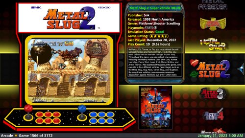
 What I love most about these themes is that the game details option doesn't change the game view. I haven't seen any other themes integrate the game details into the game view like this before. Game List Game Details5 points
 -
These are superbly designed and presented. In BigBox they really grab your attention while not cluttering up the screen. And I really like the inclusion of the vintage 8-bit systems. Hats off to you @viking5 points
-
Breath taking work mate! can't wait til I make time to design some!5 points
-
 This set has something that no other video set on LaunchBox has and that's nostalgia. Seeing the consoles set up with their peripherals on a TV from the era bring memories flooding back. I would highly recommend these videos over the default platform videos.5 points
 -
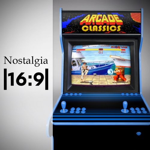
These videos are amazing, They are very crisp, clean and complete the look of my Big Box platform selection. Just a couple of things though, My PC is hooked up to my big telly so would you be able to do these in 16:9 aspect ratio & also I just need a Commodore 64 video, Magnavox Odyssey 2 video & Sinclair ZX Spectrum +2 video to complete my collection if you get time please, Keep up the good work.5 points
-
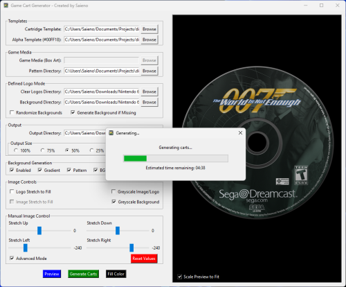 This is actually glorious! Very easy to use, intuitively designed with the ways it's folders are setup making customization easy. While I was trying it out for some pokemon hack saves it occurred to me that I can also recolor the existing templates and add patterns myself! I recolored the GBA cart and did some testing, I will upload the result, I'll throw in an octopus for good measure, I decided to go for the purple one! I find it's ease of use allows me to enjoy the process of making my carts, it's a bit addictive to me. The included patterns are also very tasteful, and the carts are very realistic and well made. I don't know what else to say since the possibilities are practically endless, it can make custom carts for your ROM hacks as well as breathe new life into your entire collection, you will be surprised of how big of a difference it makes. I see this as a must have now.4 points
 -
 Thank you so much for the update! Works Well! This got me inspired to make a Xeno Crisis bezel, so I included it here. xenocrisis.zip4 points
 -
Good thing I stumbled upon this. It's the best theme available now and needs to be added to the app downloader. Great work!4 points
-
 One more wonderfull Plugin by JoeViking245 😀 works like a charm! Why use LaunchBox as your digital movie library? Because you can. I totally agree, Launchbox can do it all! 💖 Platform Icon4 points
 -
 The most amazing MAME artwork pack out there, but those screen scratches are super annoying in dark games (glare can be distracting too), I get the whole realistic theme and respect it, but this is too much.4 points
 -
 One of the most ambitious creations on this website. No question. Amazing stuff!4 points
 -
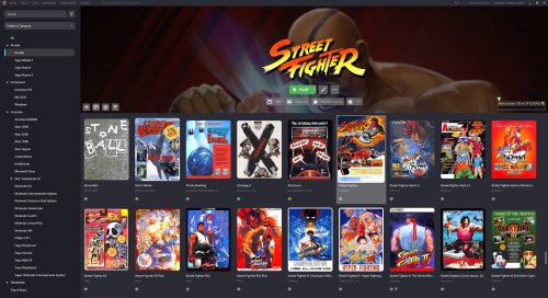
.thumb.png.27c03f351f4990631a7c1941d58da7cc.png) If you are looking for PS2 boxart, you have come to the right place because this is the best PS2 Boxart on the entire Internet4 points
If you are looking for PS2 boxart, you have come to the right place because this is the best PS2 Boxart on the entire Internet4 points -
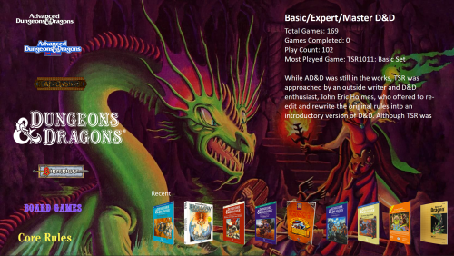 Awesome job on this and extra props for taking the time to write out detailed instructions. I was inundated at first but after 3 days was able to get 90% up and operational. Its great having all these compiled in one place and i am still looking forward to tinkering with some of the old school D&D programs.4 points
 -
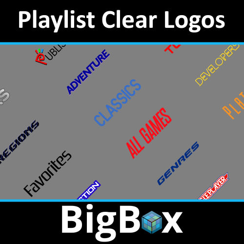 @Lugawigaming How about this: A simple, yet elegant collection of playlist logos. Not a bunch of flashy smoke being blown up your...waaaaait a minute. This collection just plain works. It's dependable and reliable. Like a '58 Chevy 1/2 ton pickup. When you just need to know what genre you are looking at, this collection delivers. Each one of these logos jumps into the captain's chair and says "make it so". And you know what? That's all we really need in a genre playlist logo collection. Also, you can slap these logos anywhere you need them to go! Currently I'm situating them neatly inside of my Crylen's bordered clear logo template to match the rest of my setup. They don't scoff at me and demand all the attention like some diva broadway star. They say, "oh you'd like me to slide over here? You got it broseph!". They bring their own party; they are content in their surroundings. They give neighboring pixels no gruff, but instead develop a reciprocal relationship so that the entire image becomes better. Not like some other logos that only seek to dominate and strut their flashiness around at the cost of everything else. When the dust settles, I know that my genre logos are better for having meshed with these fine playlist logos. And we all come out winners.4 points
 -
Great stuff! As a beta tester for Community Theme Creator, I can honestly say it's a huge gift to the LaunchBox community and to the aspiring theme creators out there who don't want to mess around with programming code. It's fairly simple to use with a lot of useful features while creating themes that can be added to BigBox.4 points
-
Stellar!4 points
-
 Awesome work my friend! this covered like 90% of my library!4 points
 -
Beautiful work, i very like much... But I miss the following videos: MAME Computers Consoles Handhelds Extras Exit Themes NEC PC Engine GT NEC TurboExpress Some are not popular, but others seem essential. In any case, great job! and thank you very much.4 points
-
amazing work!4 points
-
Best collection I've ever seen. This gives a whole new enjoyment level to my arcade box. Truly amazing work. You are to be congratulated.4 points
-
 Thank you for making those themes and sharing them. I like them very much, great work!4 points
 -
Phenomenal. Others have already said it, what great style! ... oozing nostalgia. Thanks for sharing your work, viking.4 points
-
 Outstanding work nyny77. These Platform videos ooze class; uncluttered and stylish with great music to match. Might I be so bold as to suggest one for the BBC Microcomputer sometime in the future?4 points
 -
 These are terrific Bezels!!! Keep up the great work pal!!!!3 points
 -
Modern, Beautiful and really easy to navigate around. Every single element has been thought about from both the users perspective and a design concept. This really is an amazing achievement @faeran. Oh and I'm definitely going to add that fancy "Play" button to my theme3 points
-
Excellent ! Thank's for all, great job !3 points
-
.thumb.png.7dc1d1010e44cf7eb774510ee178f1b4.png) Great set, can tell a lot of work went into this. Thanks for sharing!3 points
Great set, can tell a lot of work went into this. Thanks for sharing!3 points -
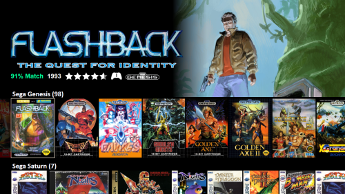 After 7+ years, I was finally tinkering around with the idea of leaving Hyperspin for Launchbox with the free version for a week or two in early November. Then I saw Eclipse and immediately pulled the trigger for the full price of a Lifetime update license for Bigbox! (And totally missed the Black Friday sale by a week in my haste XD) You should get a commission I've been running it on a couple arcade cabinets and I really really love the look and feel to the work Fry has done here. Thank you for creating this! Setup: 5/5 - Very easy to install, just follow the instructions in Fry's video. Functionality: 4.5/5 - For an early version it's highly functional and looks great. I'm super impressed how it all comes together. A couple minor critiques: You may struggle with long lists of games. Netflix UI doesn't show you every movie they have to stream, but what you're most likely to enjoy and then leave it to the user to search. I think it could work like that in the future with an option to have only your high % games show based on what you've played, depending on how that algo develops to your preferences. Loading does take awhile, but since I'm new to Bigbox I don't really have anything to compare it to. You can rename steam webm movies to .mp4 and they'll run, easy workaround. I don't really understand the caching and sometimes need to delete artwork for it to pick up new cover art. Even though I flush "all" the cache. This is probably a bigbox thing. I think it'd look really cool if the top right movie quarter could play a little under the box art/titles, giving it the appearance that the box art slightly "floats" over the small movie preview. This may be a bigbox limitation though so no big deal, it looks great already. The black background under the box art stands out a little in contrast. I'd really enjoy if there was something like a "Most Played" row, a "Least Played" row or similar... showing 20-30 titles each. I think there's a lot here that can be done to add/remove discovery options to configure. This is a beautiful and amazing theme that I'd be down to donate for continued updates. My wife (who's not a gamer) exclaimed how insanely cool it was when she first saw and played through with it. It's REALLY nice to have a front end that people know how to use intuitively when they sit down. Thanks again. Highly recommend everyone try this gem out.3 points
 -
 A great effort with nice additions. I like the extra information on screen. Nice! Thanks for sharing.3 points
 -
 Doesn't get more simplistic and straight forward than that! Great practical example!!3 points
 -
.thumb.png.6e84a4dbc77f8ecdb653cf04dd0eb4c2.png) As stated, this is THE best set you will find !! 👍3 points
As stated, this is THE best set you will find !! 👍3 points -
 Another AWESOME theme to add to my setup! No complaints here! BIG thanks to Faeran for making this!3 points
 -
This theme is awesome, near to be perfect. I Think that another alternative view would be great: Name, company, release date and genres on top right. And game description on bottom. I have tried to modify your theme but it is a bit difficult for me.3 points
-
Awesome ! Best theme Genesis currently3 points
-
 Beautiful theme. Looks how much it makes my backgrounds pop.3 points
 -
Amazing videos, like the retro music that goes along with each era of the console.3 points
-
Amazing videos that all follow the same style which go perfect with my setup, clean, simple and plenty of platforms to choose from....PERFECT!!! keep up the great work my friend3 points
-
Awesome really great videos for the platforms . A polished look with great BGM !!! Love this!!!3 points


2DBox.thumb.png.faa823f30194b63ce76f522a7ec16c1d.png)

.thumb.png.8ee33ada3082fb2676ad68894145c66b.png)


.thumb.png.916fffa3138540195e62f61daaecddd0.png)


.thumb.png.27c03f351f4990631a7c1941d58da7cc.png)


.thumb.png.7dc1d1010e44cf7eb774510ee178f1b4.png)


.thumb.png.c9faf450e4d2b690a819048b18173f61.png)


.thumb.png.6e84a4dbc77f8ecdb653cf04dd0eb4c2.png)


